Nexelia Academy · Official Revision Notes
Complete A-Level revision notes · 8 chapters
This chapter introduces methods for representing numerical data, distinguishing between qualitative, discrete, and continuous quantitative data. It details the construction and interpretation of stem-and-leaf diagrams for small discrete datasets, and histograms and cumulative frequency graphs for continuous data, emphasizing the importance of class boundaries and frequency density. The chapter concludes by guiding the selection of appropriate data representation methods based on data type, quantity, and purpose.
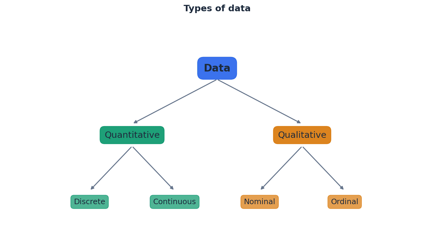
Qualitative data — Qualitative (or categorical) data are described by words and are non-numerical, such as blood types or colours.
This type of data categorizes observations into groups or types, rather than measuring them numerically. It helps in understanding characteristics or attributes that cannot be quantified. Imagine describing your favorite fruits: apple, banana, orange. These are categories, not numbers, just like qualitative data.
Categorical data — Qualitative (or categorical) data are described by words and are non-numerical, such as blood types or colours.
This is another term for qualitative data, emphasizing that the data falls into distinct categories. It is used when observations can be sorted into groups based on shared characteristics. Think of sorting clothes by color (red, blue, green); each color is a category, similar to categorical data.
Students often think qualitative data can sometimes be numerical, but actually it is strictly non-numerical and descriptive. Also, while some categorical data can be ordered (e.g., small, medium, large), not all of it can (e.g., blood types).
Quantitative data — Quantitative data take numerical values and are either discrete or continuous.
This type of data involves numerical measurements or counts, allowing for mathematical operations and statistical analysis. It provides information about quantities. Counting the number of students in a class or measuring their heights are examples of quantitative data, as they involve numbers.
Discrete data — Discrete data can take only certain values, as shown in the diagram.
This type of quantitative data results from counting and cannot be made more precise; there are distinct, separate values with no intermediate values possible. Examples include the number of items or shoe sizes. Counting the number of cars in a parking lot: you can have 1, 2, or 3 cars, but not 2.5 cars. This is like discrete data.
Continuous data — Continuous data can take any value (possibly within a limited range), as shown in the diagram.
This type of quantitative data results from measurement and can be made more precise, limited only by the accuracy of the measuring equipment. It can take any value within a given interval. Measuring a person's height: it could be 170 cm, 170.5 cm, 170.53 cm, and so on, limited only by the ruler's precision. This is like continuous data.
Students often think all numerical data is the same, but actually quantitative data is further divided into discrete (counted) and continuous (measured) types. Also, students often think discrete data must be integers, but it can take non-integer values like shoe sizes, as long as there are distinct, separate values. For continuous data, students often think it's always given with many decimal places, but it's the potential for infinite precision that defines it.
When describing quantitative data, always specify whether it is discrete or continuous, as this affects the appropriate representation and analysis methods. When identifying discrete data, look for situations where values are counted or have specific, fixed increments.
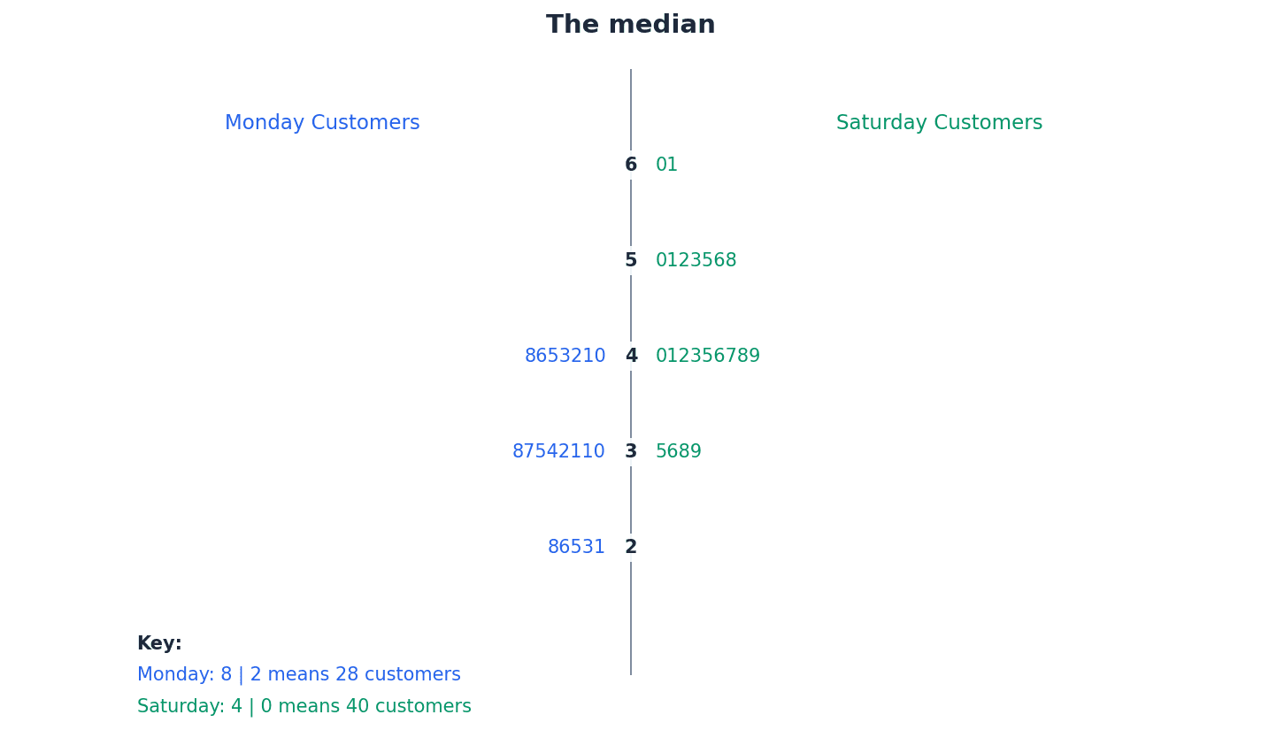
For small discrete datasets, a stem-and-leaf diagram is an effective way to display numerical data. This method separates each value into a 'stem' (the leading digit(s)) and a 'leaf' (the trailing digit), retaining the raw data while providing a visual representation of its distribution. It is particularly useful for comparing two related sets of data using a back-to-back stem-and-leaf diagram.
Stem-and-leaf diagram — A stem-and-leaf diagram is a type of table best suited to representing small amounts of discrete data.
It displays numerical data by separating each value into a 'stem' (the leading digit(s)) and a 'leaf' (the trailing digit). This method retains the raw data while providing a visual representation of its distribution, making it useful for comparisons. Imagine a tree branch (stem) with leaves (individual data points) growing off it. The leaves are ordered along the branch, and the branches are ordered vertically.
Key — A key with the appropriate unit must be included to explain what the values in the diagram represent.
In a stem-and-leaf diagram, the key clarifies how the stem and leaf digits combine to form the actual data values, including any decimal places or units. Without it, the diagram is ambiguous. Like a legend on a map, the key tells you what each symbol or number in the diagram actually means.
Students often omit the key in stem-and-leaf diagrams, making the diagram uninterpretable. Always include a clear and correct key, as it is a mandatory component for full marks.
Always include a key with appropriate units in a stem-and-leaf diagram to explain what the values represent, as this is crucial for interpretation and often a mark-earning point.
Back-to-back stem-and-leaf diagram — In a back-to-back stem-and-leaf diagram, the leaves to the right of the stem ascend left to right, and the leaves on the left of the stem ascend right to left.
This diagram is used to compare two related sets of data by sharing a common stem. It allows for easy visual comparison of the distributions of the two datasets. Think of two plants growing from the same central stalk, with leaves spreading out to either side, allowing you to compare their growth patterns.
Students often draw leaves in a back-to-back stem-and-leaf diagram incorrectly, failing to order them ascending outwards from the stem on both sides. The leaves on the left side of the stem must ascend right to left.
Ensure the leaves on both sides are correctly ordered (ascending outwards from the stem) and that a clear key is provided for both sets of data when constructing a back-to-back stem-and-leaf diagram.
When dealing with continuous data, especially when grouped into classes, it is crucial to define precise class boundaries rather than using the stated class limits. This eliminates gaps between classes and ensures continuity, which is essential for accurate representation in histograms and cumulative frequency graphs. These boundaries are calculated by finding the midpoint between the stated limits of adjacent classes.
Lower class boundary — Lower class boundaries are 145.5, 150.5 and 155.5cm.
For continuous data, the lower class boundary is the precise minimum value that can belong to a class, calculated by finding the midpoint between the stated lower limit of the class and the upper limit of the preceding class. It eliminates gaps between classes. If a road sign says 'Speed Limit 50-60 mph', the lower class boundary is not 50, but 49.5, meaning any speed from 49.5 up to 50.5 is rounded to 50.
Upper class boundary — Upper class boundaries are 150.5, 155.5 and 160.5cm.
For continuous data, the upper class boundary is the precise maximum value that can belong to a class, calculated by finding the midpoint between the stated upper limit of the class and the lower limit of the succeeding class. It ensures continuity between classes. Following the road sign example, the upper class boundary for 50-60 mph is 60.5, meaning any speed up to 60.5 is rounded to 60.
Class mid-values — Class mid-values are (145.5 + 150.5)/2 = 148, (150.5 + 155.5)/2 = 153 and (155.5 + 160.5)/2 = 158.
Also called midpoints, these are the average of the lower and upper class boundaries for a given class. They represent the central value of each class and are often used in calculations of measures of central tendency. If you have a group of friends whose ages range from 10 to 20, the midpoint age of that group would be 15, representing the average age within that range.
Students often use the given class limits (e.g., 146-150) directly for continuous data calculations, rather than correctly determining the class boundaries (e.g., 145.5-150.5). This leads to incorrect class widths and subsequent errors in histograms and cumulative frequency graphs.
Always calculate class boundaries for continuous data by considering the precision of the measurements (e.g., to the nearest cm means boundaries are .5 above/below the stated limits) to avoid errors in histogram construction.
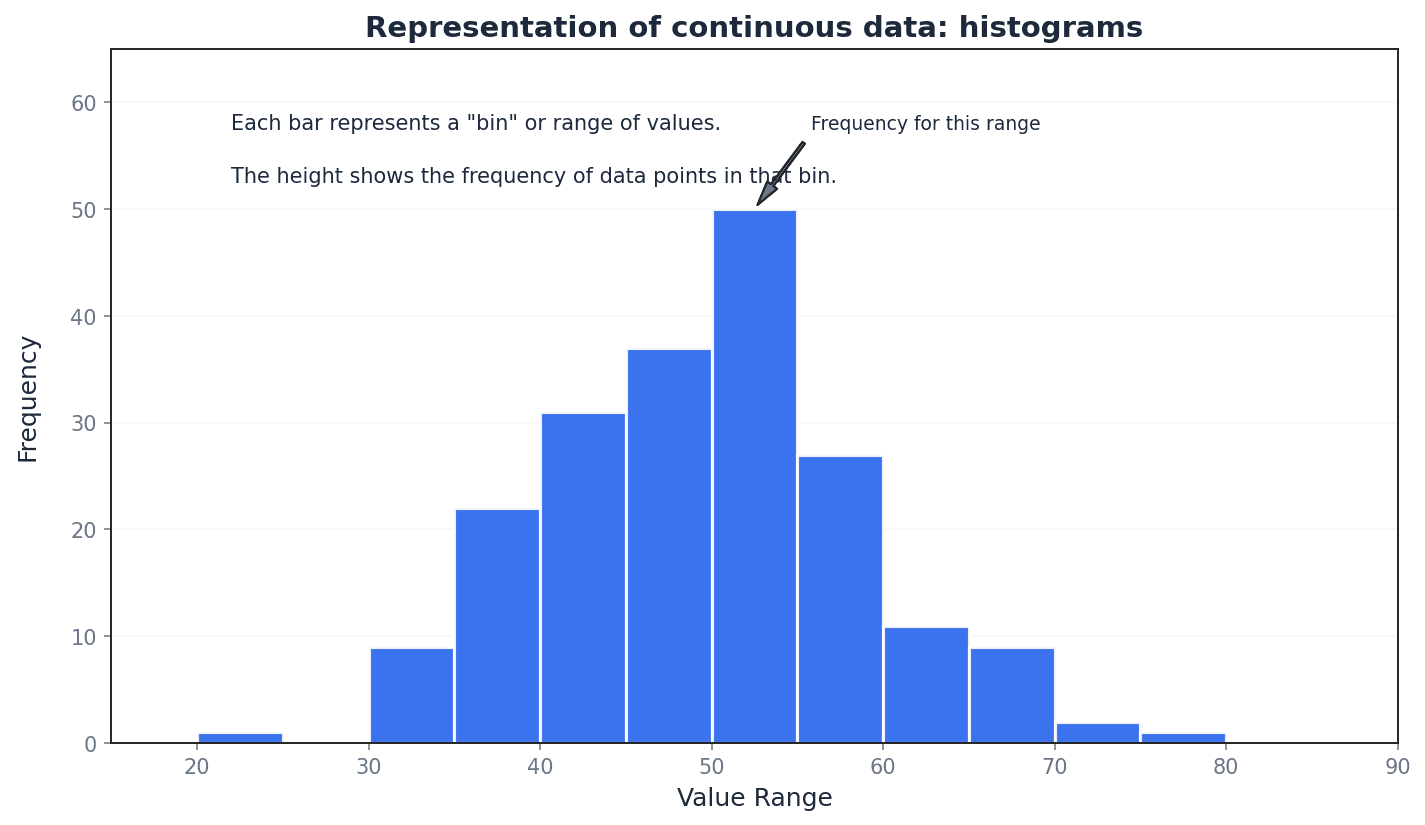
Histograms are graphical representations best suited for continuous data, though they can also illustrate discrete data. Unlike bar charts, the columns in a histogram have no gaps (unless a class has zero frequency), and the horizontal axis is a continuous number line. The key feature of a histogram is that the area of each column is proportional to the frequency of the corresponding class, which is particularly important when class widths are unequal.
Histograms — A histogram is best suited to illustrating continuous data but it can also be used to illustrate discrete data.
It is a graphical representation of the distribution of numerical data, where the area of each column is proportional to the frequency of the corresponding class. Unlike bar charts, there are no gaps between columns (unless a class has zero frequency) and the horizontal axis is a continuous number line. Imagine a city skyline where each building's width represents a range of values (class width) and its area represents how many data points fall into that range (frequency).
Students often confuse histograms with bar charts. In a histogram, the area of the bar represents frequency, and there are no gaps between bars for continuous data, unlike bar charts where bar height represents frequency and gaps exist.
Frequency density — The vertical axis of the histogram is labelled frequency density, which measures frequency per standard interval.
Frequency density is calculated by dividing the class frequency by the class width. It ensures that the area of each column in a histogram is proportional to the frequency, especially when class widths are unequal. If you have 10 people in a 5-meter wide room, the 'density' is 2 people per meter. Similarly, frequency density is 'frequency per unit of class width'.
Frequency density
Used for constructing histograms, especially with unequal class widths, to ensure column area is proportional to frequency.
Class frequency (from frequency density)
Used to calculate the frequency of a class when its frequency density and class width are known, often for estimating frequencies from a histogram.
Students often think frequency density is just frequency, but actually it's frequency divided by class width, which is crucial for correctly representing data in histograms with unequal class intervals. Also, students often assume that the class with the highest frequency in a histogram also has the highest frequency density, which is not necessarily true, especially with unequal class widths.
For histograms with unequal class widths, remember that the vertical axis must be labelled 'frequency density', not 'frequency', and the area of each column is proportional to its frequency. Always calculate frequency density correctly (frequency / class width) when constructing histograms, particularly when class intervals are not uniform.
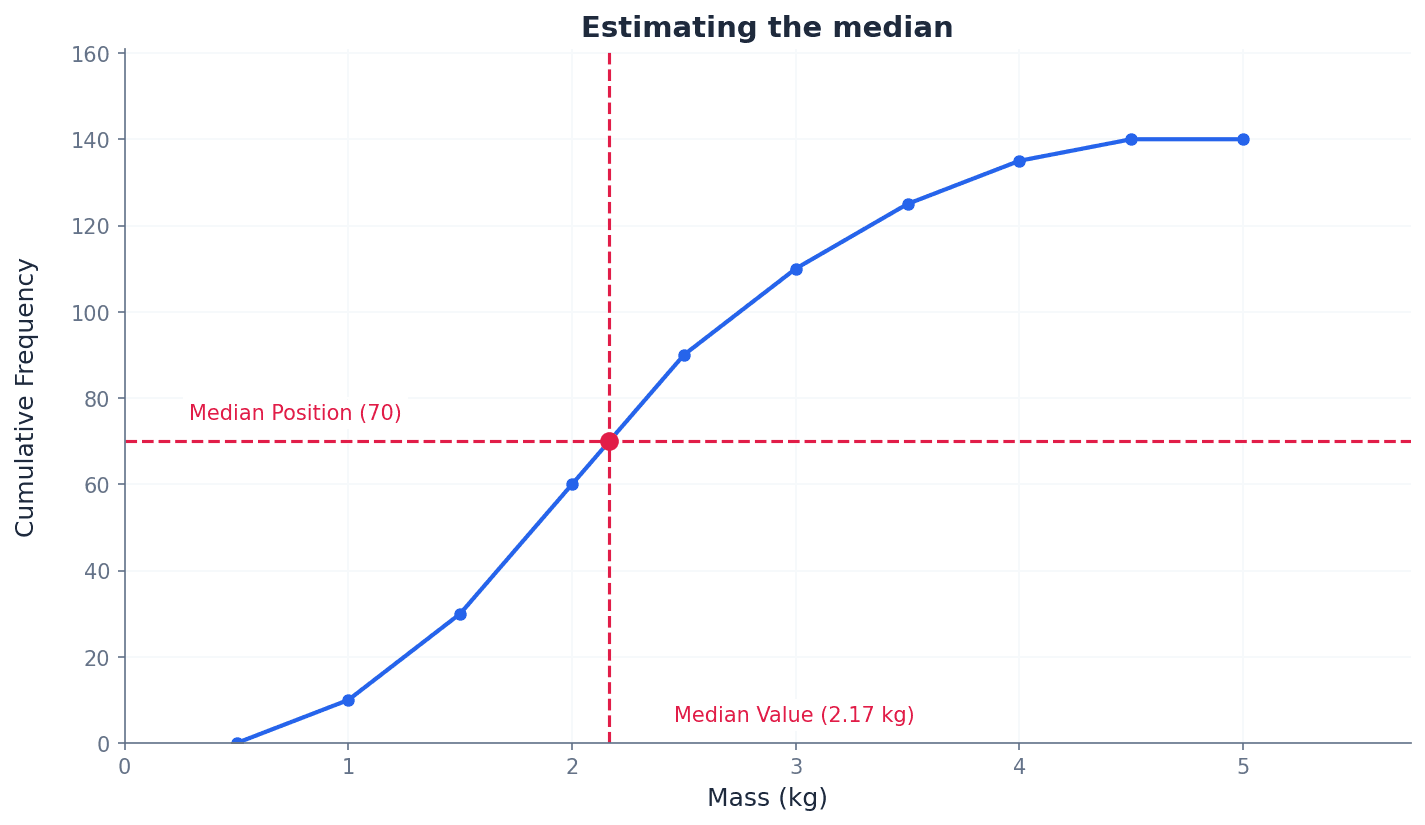
Cumulative frequency graphs are another method for representing continuous data, allowing for the estimation of values such as medians, quartiles, and percentiles. These graphs plot the cumulative frequency against the upper class boundaries. They can be drawn as a polygon (straight lines connecting points) or a smooth curve, each offering a slightly different interpretation of the data distribution.
Cumulative frequency — Cumulative frequency is the total frequency of all values less than a given value.
It is a running total of frequencies, where each cumulative frequency value represents the sum of all frequencies up to the upper boundary of a particular class. It helps in determining the number of observations below a certain point. Imagine a running tally of scores in a game; each cumulative frequency is the total score up to that point, including all previous scores.
Cumulative frequency graph — A cumulative frequency graph can be used to represent continuous data.
This graph plots cumulative frequencies against upper class boundaries. It can be drawn as a polygon (straight lines) or a smooth curve and is used to estimate values like medians, quartiles, and percentiles, or the number of values above/below a certain point. Think of a staircase where each step represents a class interval, and the height of the step is the cumulative frequency up to that point, showing how the total count builds up.
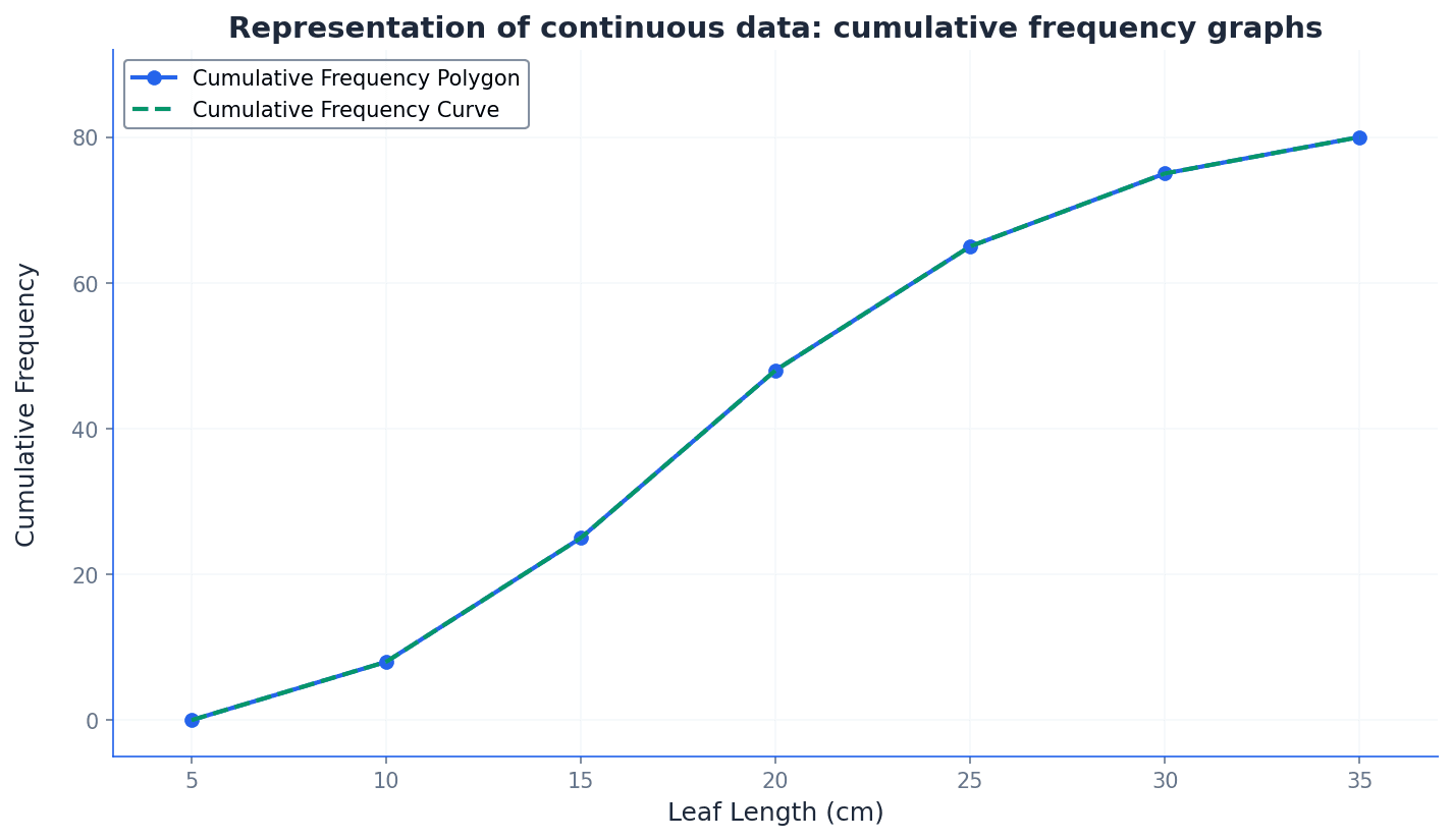
Cumulative frequency polygon — If we are given grouped data, we can construct the cumulative frequency diagram by plotting cumulative frequencies (abbreviated to cf) against upper class boundaries for all intervals. We can join the points consecutively with straight-line segments to give a cumulative frequency polygon.
This is a specific type of cumulative frequency graph where the plotted points are connected by straight lines. It provides a direct and unambiguous representation of the cumulative frequency distribution, and estimates from it should match those from a histogram. Imagine connecting the dots on a graph with a ruler; each line segment represents the assumption of an even spread of data within that class interval.
Cumulative frequency curve — If we are given grouped data, we can construct the cumulative frequency diagram by plotting cumulative frequencies (abbreviated to cf) against upper class boundaries for all intervals. We can join the points consecutively with straight-line segments to give a cumulative frequency polygon or with a smooth curve to give a cumulative frequency curve.
This is a type of cumulative frequency graph where the plotted points are joined by a smooth, freehand curve. It aims to represent the underlying continuous distribution more fluidly, though estimates from it may vary between individuals. Think of drawing a smooth, flowing line through a series of points, trying to capture the general trend rather than the exact straight-line connections.
Students often plot cumulative frequencies against class mid-values instead of upper class boundaries on cumulative frequency graphs. Remember that cumulative frequencies are plotted against the upper class boundaries. Also, students often think a cumulative frequency graph must always be a smooth curve, but a polygon (straight-line segments) is also valid and often more precise for estimates.
When constructing a cumulative frequency graph, ensure you plot cumulative frequencies against the upper class boundaries, and include a point at the lowest class boundary with a cumulative frequency of 0. When asked to draw a cumulative frequency graph, clearly label both axes, plot points accurately at upper class boundaries, and ensure the graph starts at (lowest class boundary, 0).
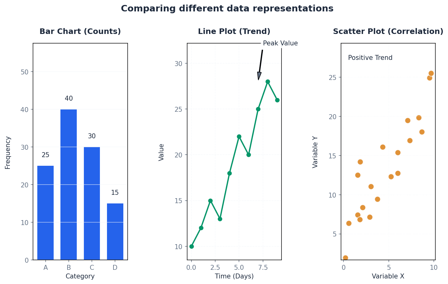
The choice of data representation method depends on the type of data, its quantity, and the purpose of the display. Stem-and-leaf diagrams are best for small discrete datasets, retaining raw data. Histograms are ideal for continuous data, showing distribution where the area of bars represents frequency. Cumulative frequency graphs are used for continuous data to estimate values like percentiles. Each method offers unique insights and is suited to different analytical needs.
Before drawing a histogram or cumulative frequency graph, create a new table with columns for class boundaries, class widths, and frequency densities or cumulative frequencies. This systematic approach helps prevent errors.
When asked to find a frequency from a histogram, use the formula: Frequency = Class Width × Frequency Density. Do not just read the height of the bar, especially with unequal class widths.
Exam Technique
Constructing a Stem-and-Leaf Diagram
Constructing a Back-to-Back Stem-and-Leaf Diagram
| Mistake | Fix |
|---|---|
| Confusing histograms with bar charts. | Remember that in a histogram, the area of the bar represents frequency, and there are no gaps between bars for continuous data. The y-axis is frequency density, not frequency. |
| Using given class limits (e.g., 146-150) directly for continuous data calculations. | Always determine the correct class boundaries (e.g., 145.5-150.5) by finding the midpoint between adjacent class limits to ensure accurate class widths and eliminate gaps. |
| Plotting cumulative frequency against class mid-values or lower boundaries. | Cumulative frequencies must always be plotted against the upper class boundaries. Also, ensure the graph starts at the lowest class boundary with a cumulative frequency of 0. |
This chapter introduces the three primary measures of central tendency: mode, mean, and median. It details their calculation for both ungrouped and grouped data, including techniques like frequency density and cumulative frequency graphs. The chapter also covers simplifying calculations with coded data and guides on selecting the most appropriate average based on data characteristics.
mode — The mode is the most commonly occurring value.
It represents the value with the highest frequency in a dataset. The mode is useful for categorical data and can be unaffected by extreme values, making it a good choice when typicality is more important than a calculated average. Imagine a shoe store: the mode would be the shoe size they sell the most of, because that's the most popular size.
mean — The mean is calculated by dividing the sum of the values by the number of values.
Also known as the arithmetic mean, it takes all values into account and is frequently used in further calculations. It is the most commonly understood average but can be significantly affected by extreme values. If you add up all your test scores and divide by the number of tests, you get your average score, which is the mean.
median — The median is the value in the middle of an ordered set of data.
It splits a set of data into two equal parts: a bottom half and a top half. The median is relatively unaffected by extreme values, making it a robust measure of central tendency for skewed distributions. If you line up all your friends by height, the person exactly in the middle is the median height.
modal class — The modal class is the class with the highest frequency density in a set of grouped data.
Since raw values cannot be seen in grouped data, the modal class provides an estimate of where the mode would lie. It is identified by the tallest column in a histogram. If you have different sized boxes of crayons, the modal class isn't necessarily the box with the most crayons, but the box type that has the most crayons per unit of box size.
frequency density — Frequency density is calculated by dividing the frequency of a class by its class width.
It is used for grouped data, particularly in histograms, to ensure that the area of each bar is proportional to the frequency, allowing for accurate comparison of frequencies across classes of different widths. Think of it like population density: it's not just how many people are in an area, but how many people per square mile. Here, it's how many data points per unit of class width.
class boundaries — Class boundaries are the values that separate one class interval from another, ensuring there are no gaps between classes in continuous data.
For discrete data, if classes are given as 8-10 and 11-12, the boundary between them is 10.5. For continuous data, these boundaries are used to calculate class widths and mid-values accurately. Think of a fence between two properties. The class boundary is the exact line where one property ends and the next begins, even if the given numbers seem to have a gap.
Mean for ungrouped data
Used when individual data values are available.
Mean for grouped data
Used when data is presented with frequencies; x represents individual values for discrete data or mid-values for grouped continuous data.
When data is presented in a grouped frequency table, the exact individual values are unknown. To estimate the mean, we use the mid-value of each class interval as a representative value for all data points within that class. The formula \bar{x} = \frac{\Sigma fx}{\Sigma f} is then applied, where 'x' represents these mid-values and 'f' is the frequency of each class. This method provides a good estimate of the mean for grouped data.
Students often confuse the modal class with the class having the highest frequency, but actually it's the class with the highest frequency density, which accounts for varying class widths.
For grouped data, remember to use the class mid-values (x) and their frequencies (f) in the formula \Sigma fx / \Sigma f. Be careful with units and significant figures in your final answer.
When dealing with multiple datasets, such as two classes of students or different types of items, their means can be combined to find an overall mean. This involves calculating the total sum of all values (\Sigma x) and the total number of values (n) across all datasets. The overall mean is then found by dividing the combined total sum by the combined total number of values, as demonstrated in examples involving total mass or total playing time.
coded data — Coded data is a transformed set of data obtained by applying an addition or multiplication (or both) of a constant to all original values.
Coding simplifies manual calculations by making numbers easier to handle, for example, by shifting the mean to a convenient value like zero. The mean of the original data can then be easily found by reversing the coding transformation. Imagine you have very large numbers like 101, 103, 104. Coding them by subtracting 100 makes them 1, 3, 4, which are much easier to work with. You just add 100 back to the average of the smaller numbers.
Mean for coded data (addition/subtraction)
Used when data is coded by adding or subtracting a constant 'b'. The mean of the original data is found by reversing the operation on the mean of the coded data.
Mean for coded data (multiplication/division)
Used when data is coded by both multiplication and addition/subtraction. To find the original mean, first undo the addition/subtraction, then undo the multiplication/division.
Students often forget to 'decode' the mean of the coded data, but actually the final step is to reverse the coding operation (e.g., add back what was subtracted, or divide by what was multiplied) to get the mean of the original data.
When working with coded data, clearly state the coding transformation used (e.g., y = x - a or y = ax). Remember that addition/subtraction shifts the mean, while multiplication/division scales it.
stem-and-leaf diagram — A stem-and-leaf diagram is a method of organizing quantitative data in a way that shows both the rank order and shape of the distribution.
It separates each data point into a 'stem' (the leading digit(s)) and a 'leaf' (the trailing digit), allowing for quick identification of the median and mode while preserving individual data values. Think of it like sorting books on a shelf by their first letter, then by their second. The 'stem' is the first letter, and the 'leaves' are the subsequent letters, keeping them in order.
Always order the data first before finding the median. For grouped data, estimate the median from a cumulative frequency graph by finding the value corresponding to n/2 on the cumulative frequency axis.
cumulative frequency graph — A cumulative frequency graph is a graph that plots cumulative frequency against the upper class boundary of each class interval.
It is used to estimate the median, quartiles, and percentiles for grouped continuous data, as the exact raw values are not available. The median is found at half the total frequency. Imagine tracking how many people finish a race over time. A cumulative frequency graph would show the total number of finishers at any given time, steadily increasing.
For grouped data, where individual values are not known, the median can be estimated using a cumulative frequency graph. This graph plots the cumulative frequency against the upper class boundary of each class interval. To find the median, locate the total frequency (n), then find the value on the x-axis corresponding to n/2 on the cumulative frequency axis. This method provides a visual estimate of the median's position within the grouped data.
Students often plot cumulative frequency against the mid-point of the class, but actually it should be plotted against the upper class boundary to correctly represent the 'up to' nature of cumulative frequency.
When drawing a cumulative frequency graph, always use upper class boundaries on the x-axis. When estimating the median, draw a horizontal line from n/2 on the cumulative frequency axis to the curve, then drop a vertical line to the x-axis.
positively skewed — Data are positively skewed when the curve's longer tail is to the side of the larger values.
In a positively skewed distribution, the mean is typically greater than the median, which is greater than the mode (Mode < Median < Mean). This indicates that there are a few unusually large values pulling the mean to the right. Imagine a graph of house prices in a neighborhood where most houses are affordable, but a few mansions exist. The tail of the graph would stretch to the right (higher prices), making it positively skewed.
negatively skewed — Data are negatively skewed when the curve's longer tail is to the side of the smaller values.
In a negatively skewed distribution, the mean is typically less than the median, which is less than the mode (Mean < Median < Mode). This indicates that there are a few unusually small values pulling the mean to the left. Consider a graph of exam scores where most students did very well, but a few scored very low. The tail of the graph would stretch to the left (lower scores), making it negatively skewed.
The choice of the most appropriate measure of central tendency depends on the characteristics of the data and the purpose of the analysis. The mean is widely used but sensitive to extreme values. The median is robust to outliers and suitable for skewed distributions. The mode is best for categorical data or when identifying the most frequent category. Understanding the data's skewness (positively or negatively skewed) helps in making an informed decision, as it affects the relative positions of the mean, median, and mode.
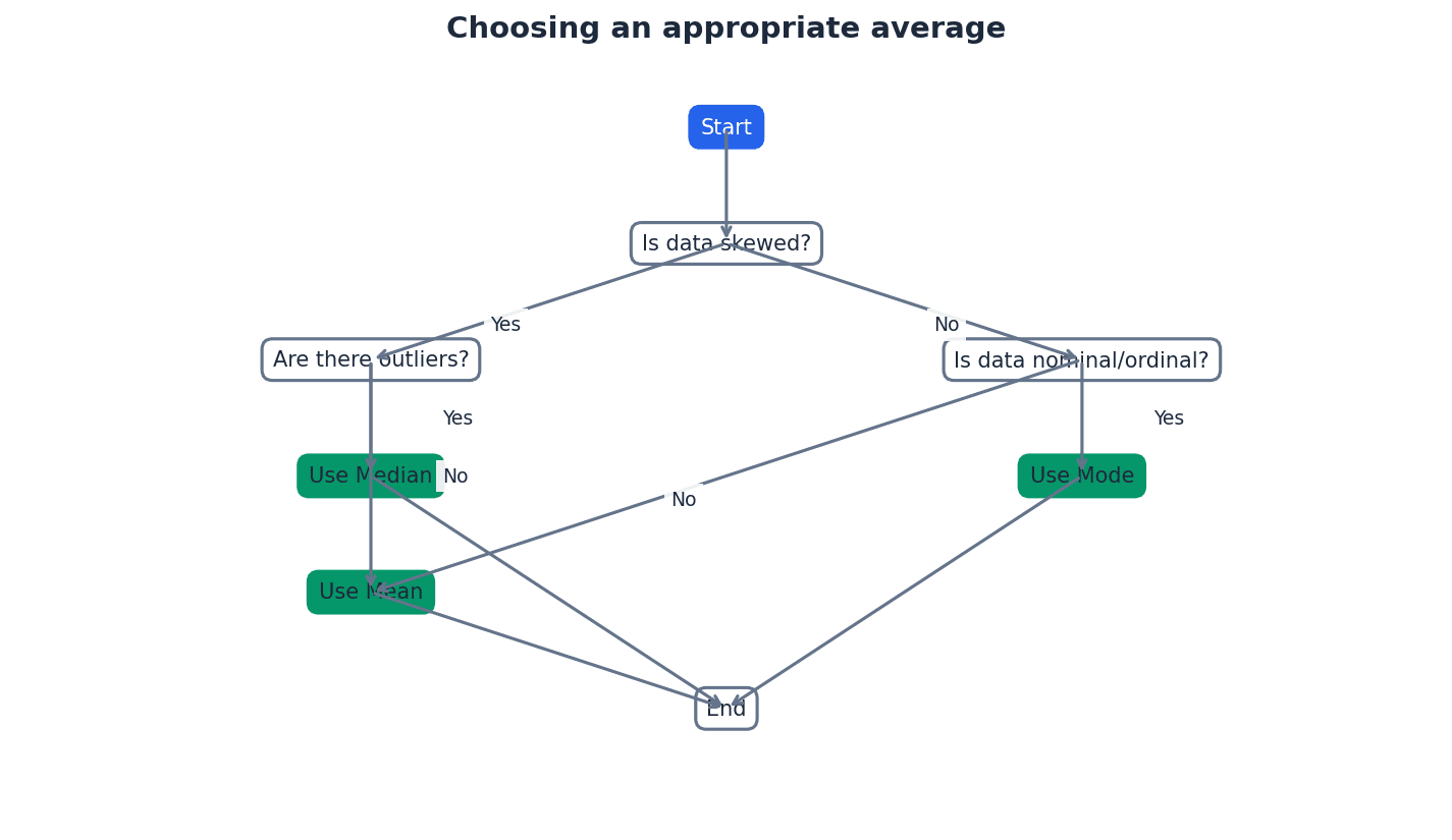
When asked to choose an appropriate average, justify your choice by considering the data's characteristics (e.g., presence of outliers, skewness).
Practice calculating means from given totals (\Sigma x or \Sigma fx) and solving problems involving combined datasets, as these are common exam question types.
Exam Technique
Find the modal class for grouped data
Calculate the mean for grouped data
| Mistake | Fix |
|---|---|
| Thinking there is always only one mode. | Remember that a dataset can have more than one mode (bimodal, multimodal) or no mode at all if all values occur with the same frequency. |
| Confusing modal class with the class having the highest frequency. | Always calculate frequency density (frequency / class width) for each class and identify the class with the highest frequency density, especially if class widths are not equal. |
| Forgetting to use mid-values when calculating the mean for grouped data. | Always calculate the mid-point of each class interval and use these mid-values (x) in the \Sigma fx formula. |
This chapter focuses on measures of variation, also known as spread or dispersion, which are crucial for understanding how widely data values are distributed. It covers the calculation and interpretation of the range, interquartile range, and standard deviation for both ungrouped and grouped data. The chapter also explores graphical representations like cumulative frequency graphs and box-and-whisker diagrams, and the impact of data coding on these measures.
Variation — Variation, also known as spread or dispersion, indicates how widely spread out the values in a set of data are.
Measures of variation complement measures of central tendency by providing information about the consistency or inconsistency of data. Two datasets can have the same mean but vastly different variations, making variation crucial for a complete summary. Imagine two groups of students with the same average test score; if one group's scores are all very close to the average, and the other group's scores range from very low to very high, the variation helps describe this difference.
Students often think that a measure of central tendency alone is sufficient to summarise data, but it tells nothing about how spread out the values are.
Range — The range is the numerical difference between the largest and smallest values in a set of data.
It is easy to calculate but only uses the two most extreme values, making it sensitive to outliers and not representative of the central values' spread. For grouped data, minimum and maximum possible ranges can be found using boundary values. For example, if the tallest person in a room is 190cm and the shortest is 150cm, the range of heights is 40cm, telling you the total span but not if most people are clustered around 160cm or 180cm.
Range
For ungrouped data.
When asked to find the range for grouped data, remember to use the lower boundary of the lowest class and the upper boundary of the highest class to determine the maximum possible range.
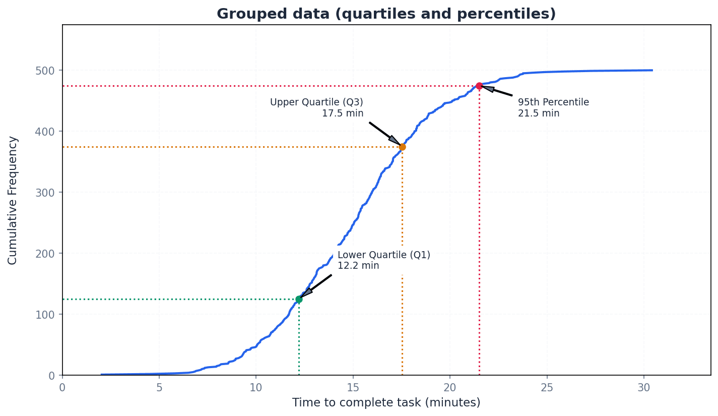
Lower quartile — The lower quartile (Q1) divides the values in a dataset into four parts, with an equal number of values in each part, marking the 25th percentile.
It is the median of the lower half of an ordered dataset. For grouped data with total frequency n, its position is at the (n/4)th or (Σf/4)th value. If you line up 100 people by height, the lower quartile is the height of the 25th person.
Median — The median (Q2 or middle quartile) is the middle value in an ordered dataset, dividing it into two equal halves, and is the 50th percentile.
It is a measure of central tendency that is less affected by extreme values than the mean. For grouped data with total frequency n, its position is at the (n/2)th or (Σf/2)th value. If you have a list of house prices, the median is the price in the middle when they are sorted, so half the houses are cheaper and half are more expensive.
Upper quartile — The upper quartile (Q3) divides the values in a dataset into four parts, with an equal number of values in each part, marking the 75th percentile.
It is the median of the upper half of an ordered dataset. For grouped data with total frequency n, its position is at the (3n/4)th or (3Σf/4)th value. If you line up 100 people by height, the upper quartile is the height of the 75th person.
Interquartile range — The interquartile range (IQR) is the numerical difference between the upper quartile and the lower quartile (Q3 – Q1), giving the range of the middle half (50%) of the values.
It is often preferred to the range because it measures the spread of the more central values and is relatively unaffected by extreme values (outliers). It can be found even when exact extreme values are unknown. If you have a class's test scores, the IQR tells you the spread of the scores for the middle 50% of students, ignoring the very highest and lowest performers.
Interquartile Range (IQR)
Range of the middle 50% of values.
Position of Lower Quartile (Q1) for grouped data
Used to estimate Q1 from a cumulative frequency graph.
Position of Median (Q2) for grouped data
Used to estimate Q2 from a cumulative frequency graph.
Position of Upper Quartile (Q3) for grouped data
Used to estimate Q3 from a cumulative frequency graph.
For ungrouped data, carefully order the values first. If n is odd, discard the median before finding Q1 and Q3; if n is even, split the data into two halves without discarding the median.
Students often confuse the position formula for quartiles with the actual quartile value. The formula gives the position in the ordered dataset, which then needs to be mapped to the data value.
Percentile — The nth percentile is the value that is n% of the way through an ordered set of data.
Quartiles are specific percentiles (Q1=25th, Q2=50th, Q3=75th). Percentiles allow for more granular analysis of data distribution, such as finding the range of the middle 80% (difference between 10th and 90th percentiles). If you score in the 90th percentile on a test, it means you scored better than 90% of the people who took the test.
Cumulative frequency graphs are powerful tools for estimating quartiles and percentiles, especially for grouped data. To find a specific percentile, locate its corresponding position on the y-axis (e.g., for the 25th percentile, find 0.25 * total frequency) and then read the value from the x-axis. This method provides an estimate of the data value at that percentile.
When estimating the median from a cumulative frequency graph, always read the value on the x-axis corresponding to the (n/2)th value on the y-axis, ensuring correct scale interpretation.
Box-and-whisker diagram — A box-and-whisker diagram (or box plot) is a graphical representation of data showing its smallest value, largest value, lower quartile, upper quartile, and median.
It provides a visual summary of the data's distribution, central tendency, and spread, making it useful for comparing different datasets and assessing skewness. It must be drawn with a scale and appropriate units. Think of it like a quick visual snapshot of a dataset's key characteristics, showing where the bulk of the data lies and how far the extremes reach.
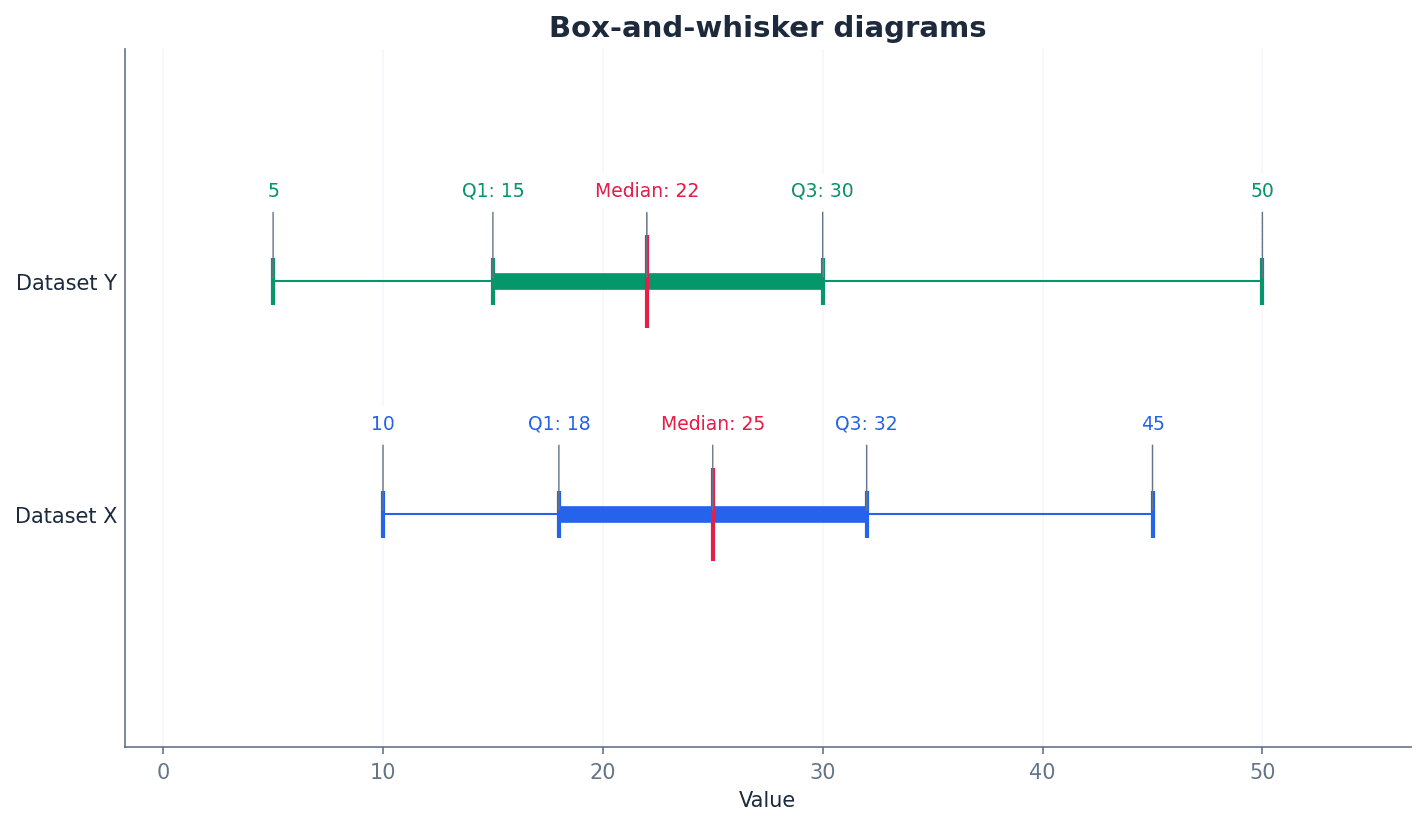
Students often draw the whiskers through the box, but the whiskers extend from the box to the smallest and largest values, not through the box itself.
Always include a clear scale and label axes with units on a box-and-whisker diagram. Ensure the median line is within the box and the whiskers extend correctly to the minimum and maximum values.
Box-and-whisker diagrams are useful for visually assessing the skewness of data. If the median line is closer to the lower quartile and the upper whisker is longer, the data is positively skewed. Conversely, if the median line is closer to the upper quartile and the lower whisker is longer, the data is negatively skewed. If the median is roughly central and whiskers are similar in length, the data is approximately symmetrical.
Outliers — Outliers are extreme values that are more than 1.5 times the interquartile range above the upper quartile or more than 1.5 times the interquartile range below the lower quartile.
These values lie significantly outside the general pattern of the data. The interquartile range is preferred over the range for measuring variation because it is less affected by outliers. For example, if most students score between 50 and 80 on a test, but one student scores 5, and another scores 98, those extreme scores might be considered outliers.
When identifying outliers, clearly state the calculated thresholds (Q1 - 1.5*IQR and Q3 + 1.5*IQR) and then compare individual data points to these thresholds.
Variance — Variance is the mean squared deviation from the mean, calculated as the sum of the squared deviations from the mean divided by the number of values.
It is a measure of variation that ensures all deviations are positive by squaring them, giving greater emphasis to larger deviations. Its units are the square of the data units (e.g., m² for measurements in metres). If you imagine how far each person in a group stands from the average position, variance is like taking each person's distance, squaring it, and then finding the average of those squared distances.
Standard deviation — Standard deviation is the square root of the variance, providing a measure of variation in the same units as the original data.
A low standard deviation indicates values are close to the mean, while a high standard deviation indicates values are widely spread. It is more commonly used than variance because its units are more interpretable. Following the previous analogy, if variance is the average of squared distances, standard deviation is like taking the square root to get back to an 'average distance' from the mean, in the original units.
Variance (ungrouped data)
Also remembered as 'mean of the squares minus square of the mean'.
Standard Deviation (ungrouped data)
Square root of the variance.
Variance (grouped data)
x represents class mid-values; provides an estimate.
Standard Deviation (grouped data)
Square root of the variance; x represents class mid-values; provides an estimate.
Students often confuse Σx² with (Σx)². Remember that Σx² means summing the squares of individual data values, while (Σx)² means squaring the sum of all data values.
Students often round the mean before calculating standard deviation. This can lead to significant errors; always use the exact sum of values (Σx) and number of values (n) for the mean in the formula.
Always use the exact values of Σx and Σx² (or Σxf and Σx²f for grouped data) in calculations to avoid substantial rounding errors in the variance and standard deviation.
The formulas for variance and standard deviation are designed to be calculated efficiently using the sum of data values (Σx) and the sum of their squares (Σx²), along with the number of values (n). For grouped data, these sums are adapted to Σxf and Σx²f, where x represents class mid-values and f is the frequency. This method is generally more robust against rounding errors than calculating deviations from a rounded mean.
When combining two datasets, say x and y, their overall mean and variance can be calculated by summing their respective totals. The combined mean is found by adding the sum of values from both datasets and dividing by the total number of values. Similarly, the combined variance requires summing the Σx² values from both datasets and applying the standard variance formula with the combined totals.
Mean of combined datasets
For two datasets x and y.
Variance of combined datasets
For two datasets x and y.
Coding data involves transforming the original values, typically through addition/subtraction or multiplication/division. Understanding how these transformations affect measures of variation is crucial. Adding or subtracting a constant to all data values shifts the entire dataset but does not change its spread, meaning the variance and standard deviation remain the same. However, multiplying or dividing by a constant scales the spread, affecting variance and standard deviation.
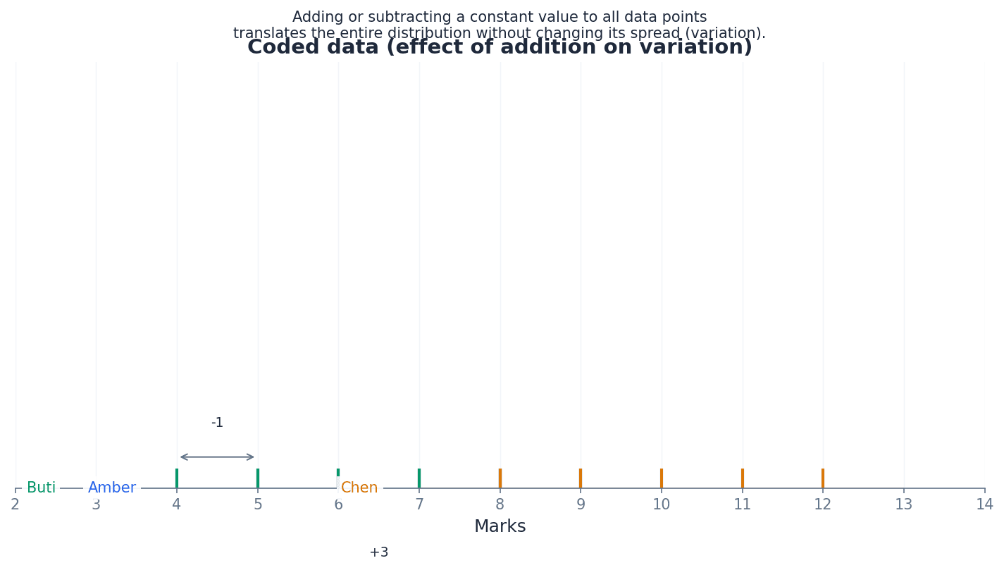
Variance of coded data (addition/subtraction)
Adding or subtracting a constant to all data values does not change the variance or standard deviation.
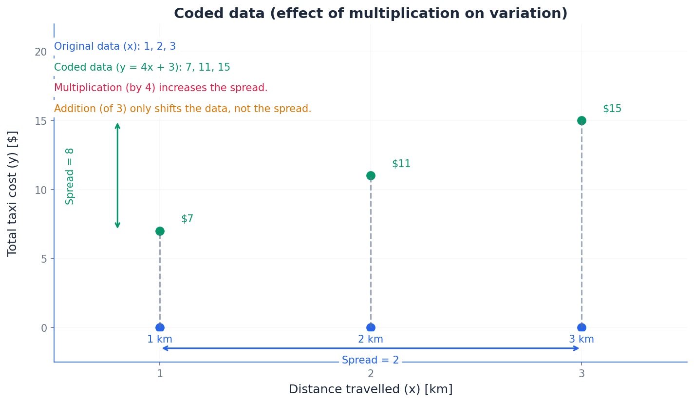
Variance of coded data (multiplication/division)
Multiplying or dividing all data values by a constant 'a' changes the variance by a².
Standard Deviation of coded data (multiplication/division)
Multiplying or dividing all data values by a constant 'a' changes the standard deviation by |a|.
Students often forget to square the constant when relating the variance of coded data (multiplication) to the original data, i.e., Var(ax) = a²Var(x).
When comparing two datasets, always discuss both a measure of central tendency (e.g., mean or median) and a measure of variation (e.g., range, IQR, or standard deviation) for a comprehensive analysis.
Use your calculator's statistical functions to find Σx and Σx² from raw data to save time and avoid manual calculation errors.
Exam Technique
Calculating Range for Grouped Data
Calculating IQR for Ungrouped Data (Odd n)
| Mistake | Fix |
|---|---|
| Confusing Σx² with (Σx)². | Remember that Σx² means squaring each data value first and then summing them, while (Σx)² means summing all data values first and then squaring the total sum. These are almost always different. |
| Rounding the mean before calculating variance or standard deviation. | Always use the exact fractional value of the mean (Σx/n) or the full value from your calculator in the variance formula to avoid significant rounding errors. Only round the final standard deviation value. |
| Incorrectly applying coding rules, especially for variance. | Remember that adding/subtracting a constant does NOT change variance or standard deviation. For multiplication/division by 'a', variance changes by a², and standard deviation changes by |a|. |
This chapter introduces the fundamental concepts of probability, defining it as the likelihood of an event on a scale from 0 to 1. It covers calculating probabilities by enumerating equiprobable events, applying addition and multiplication laws, and distinguishing between mutually exclusive and independent events. Understanding conditional probabilities is also crucial for assessing how additional information impacts likelihoods.
Probability — Probability measures the likelihood of an event occurring on a scale from 0 (impossible) to 1 (certain).
It can be expressed as a fraction, decimal, or percentage. A higher probability indicates a greater likelihood of the event happening, much like a weather forecast saying there's a 0.9 (90%) chance of rain means it's very likely to rain.
Always express probabilities as fractions, decimals, or percentages as specified in the question, and ensure values are between 0 and 1 inclusive.
Students often think probability is always 0.5 for any event. Remember that it depends on the number of favourable outcomes relative to the total possible outcomes.
Outcome — The result of an experiment is called an outcome or elementary event.
For example, when rolling a die, each number (1, 2, 3, 4, 5, 6) is an outcome. These are the simplest results you can get, like 'heads' or 'tails' when flipping a coin.
Elementary event — The result of an experiment is called an outcome or elementary event.
An elementary event is a single, indivisible result of a random experiment, such as rolling a '3' on a die. It forms the building blocks for more complex events, similar to picking a single 'Ace of Spades' from a deck.
Students often confuse outcomes with events. An event can be a combination of several outcomes, while an elementary event is the simplest form of an event, representing a single outcome.
Event — A combination of outcomes or elementary events is known simply as an event.
For example, obtaining an odd number when rolling a die is an event that combines the outcomes 1, 3, and 5. Events are what we typically calculate probabilities for, like 'rolling a double' in a board game.
Clearly define the event in question before attempting to list its favourable outcomes to ensure accuracy in calculations.
Equally likely — The selection of any particular object is said to be equally likely or equiprobable.
This means each outcome has the same chance of occurring. Random selection ensures that events are equally likely, making probability calculations straightforward by counting favourable outcomes, just as each face of a fair die is equally likely to land face up.
Equiprobable — The selection of any particular object is said to be equally likely or equiprobable.
This term is synonymous with 'equally likely', meaning each possible outcome of an experiment has the same probability of occurring. This is a fundamental assumption for many basic probability calculations, like drawing any card from a well-shuffled deck.
Students often assume events are equally likely without justification. This must be explicitly stated or inferred from the context (e.g., 'fair die', 'random selection').
Always check if events are stated to be 'fair' or 'randomly selected' to confirm they are equiprobable before applying the basic probability formula.
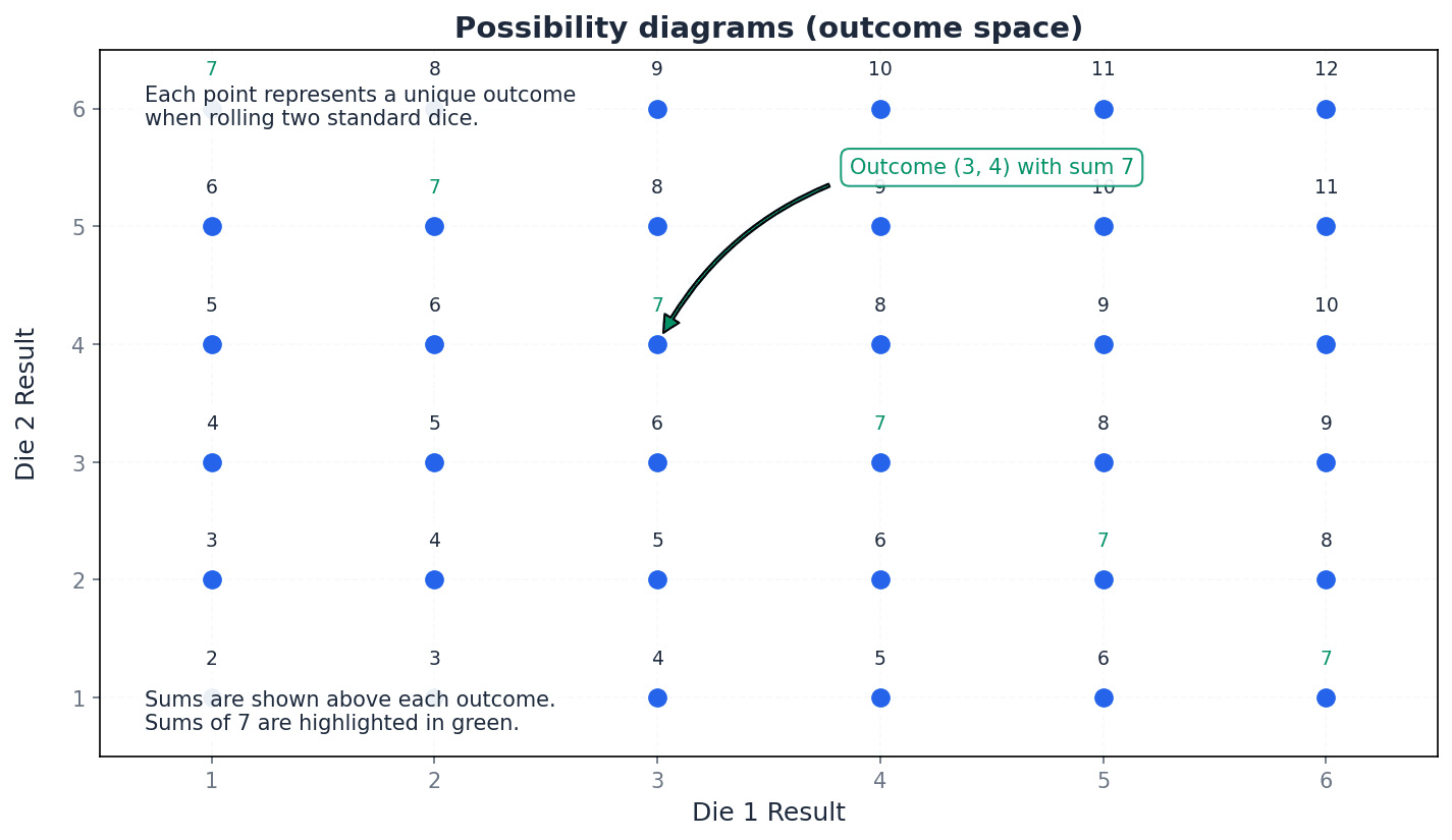
Universal set — The universal set ℰ represents the complete set of outcomes and is called the possibility space.
It encompasses all possible elementary events in a given experiment. In Venn diagrams, it is typically represented by a rectangle containing all other sets, similar to considering all students in a school as the universal set.
Possibility space — The universal set ℰ represents the complete set of outcomes and is called the possibility space.
This is the set of all possible outcomes of a random experiment. It is crucial for defining the scope of probability calculations and ensuring all outcomes are accounted for, such as the 36 possible pairs when rolling two dice.
For problems involving multiple events (e.g., rolling two dice), drawing a possibility diagram (grid) helps to visualise and count all outcomes in the possibility space accurately.
Probability of an event
Used when all outcomes are equally likely.
Probability of a particular object
Applies when one object is randomly selected from 'n' objects.
Exhaustive events — A set of events that contains all the possible outcomes of an experiment is said to be exhaustive.
For example, when tossing a coin, 'heads' and 'tails' are exhaustive events because they cover all possible outcomes. The sum of probabilities of exhaustive events is 1, like categorizing all students by their favourite colour.
Trial — Each repeat of an experiment is called a trial.
For instance, each time you toss a coin, it's a trial. The results of multiple trials are used to estimate probabilities through relative frequency, similar to each patient in a medicine trial.
Relative frequency — The proportion of trials in which an event occurs is its relative frequency, and we can use this as an estimate of the probability that the event occurs.
It is calculated as (number of times event occurs) / (total number of trials). As the number of trials increases, the relative frequency tends to converge to the true probability, like flipping a coin 100 times to estimate the probability of heads.
Expectation — If we know the probability of an event occurring, we can estimate the number of times it is likely to occur in a series of trials. This is a statement of our expectation.
Expectation is calculated by multiplying the probability of an event by the number of trials. It represents the average number of times an event is predicted to occur over many repetitions, such as expecting to win 20 games out of 100 if the probability of winning is 0.2.
Students often think expectation guarantees the outcome. Remember that it's an average prediction; the actual number of occurrences can vary from the expectation.
Complementary events
Used for exhaustive events where one or the other must occur.
Expectation of an event
Provides an estimate of the number of occurrences over a series of trials.
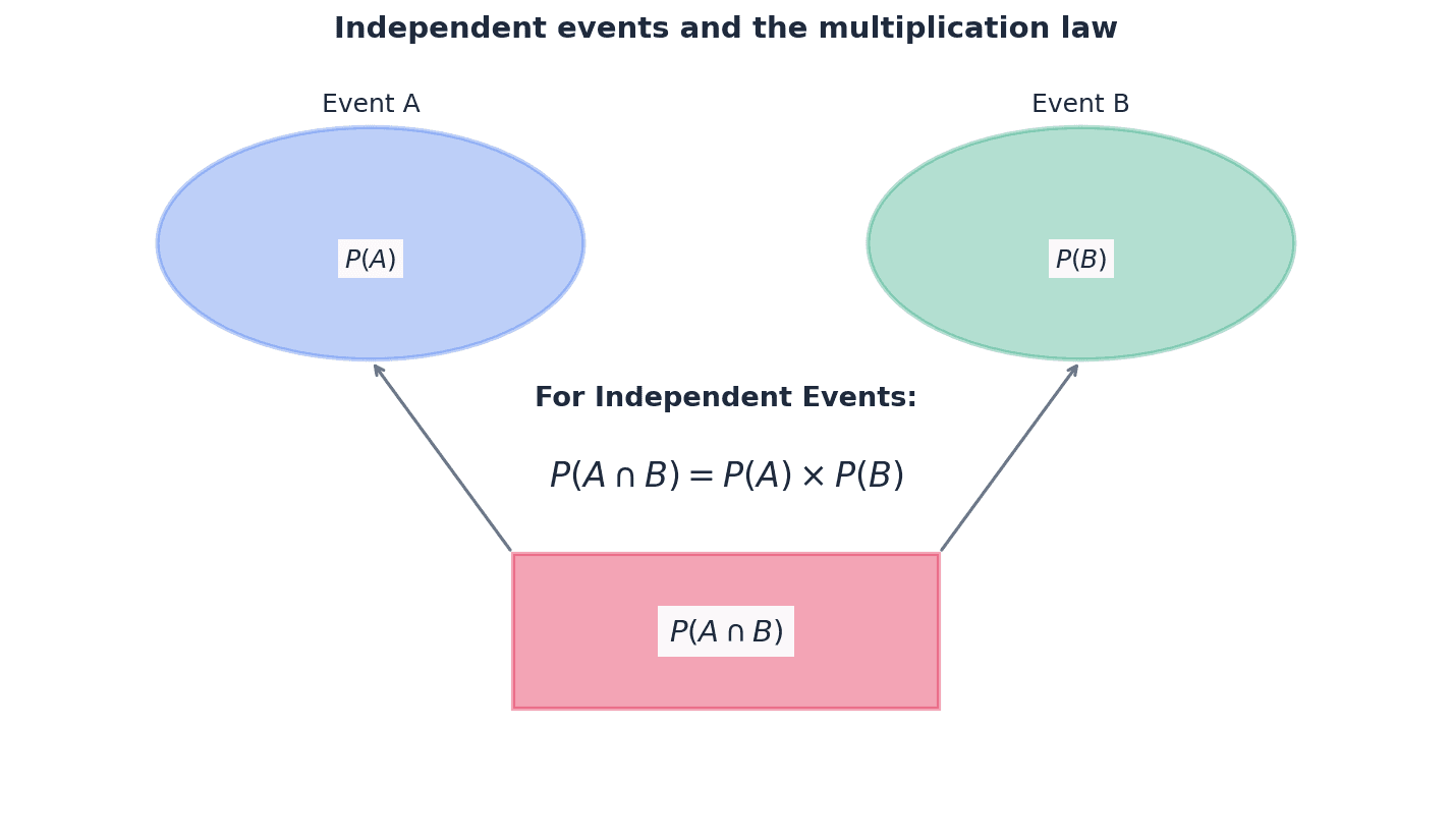
Mutually exclusive events — Mutually exclusive events have no common favourable outcomes, which means that it is not possible for both events to occur.
For example, when rolling a die, 'even number' and 'factor of 5' are mutually exclusive because no number is both. Their intersection is an empty set, so P(A and B) = 0. You can't be both 'asleep' and 'awake' at the same time.
Addition law for mutually exclusive events
Only applicable when events A and B have no common outcomes (A \cap B = \emptyset).
General addition law for any two events
Used for both mutually exclusive and non-mutually exclusive events. If mutually exclusive, P(A \cap B) = 0.
The addition laws are used to find the probability of event A *or* event B occurring. If events A and B are mutually exclusive, meaning they cannot happen simultaneously, the probability of A or B is simply the sum of their individual probabilities, P(A) + P(B). However, for any two events, whether mutually exclusive or not, the general addition law P(A ∪ B) = P(A) + P(B) - P(A ∩ B) must be used. The term P(A ∩ B) accounts for outcomes counted twice when events are not mutually exclusive.
If events A and B are mutually exclusive, the addition law simplifies to P(A or B) = P(A) + P(B). Do not subtract P(A and B) as it is zero.
Independent events — Two events are said to be independent if either can occur without being affected by the occurrence of the other.
This means the probability of one event happening does not change if the other event has already happened. For independent events A and B, P(A and B) = P(A) * P(B), similar to how the result of a first coin flip doesn't affect a second flip.
Dependent events — Two events are mutually dependent when neither can occur without being affected by the occurrence of the other.
This means the probability of one event changes based on whether the other event has occurred. Selections without replacement are a common example of dependent events, such as drawing two cards from a deck without replacement where the second draw's probability depends on the first.
Students often confuse mutually exclusive events with independent events. Mutually exclusive means they cannot happen together (P(A and B) = 0), while independent means one doesn't affect the other (P(A and B) = P(A)P(B)).
Multiplication law for independent events
Only applicable when the occurrence of one event does not affect the probability of the other.
To determine if two events, A and B, are independent, you must explicitly check if the multiplication law for independent events holds true. This involves calculating the probability of both events occurring, P(A ∩ B), and comparing it to the product of their individual probabilities, P(A) × P(B). If P(A ∩ B) = P(A) × P(B), then the events are independent. Simply stating they are independent without this calculation is insufficient.
To prove independence, you must show that P(A and B) = P(A) * P(B). Simply stating they are independent is not sufficient for 'determine with justification' questions.
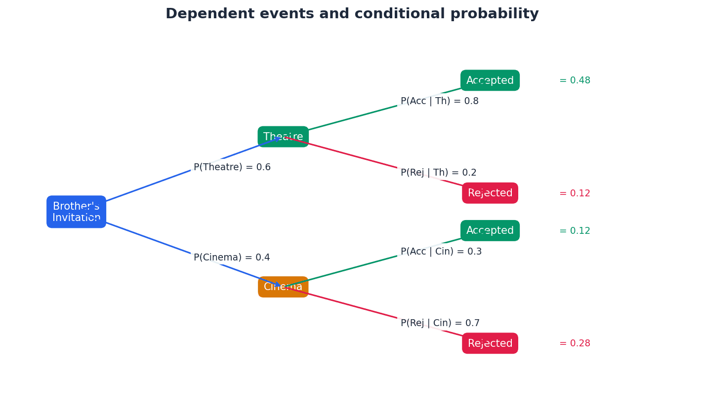
Conditional probability — The word conditional is used to describe a probability that is dependent on some additional information given about an outcome or event.
It is the probability of an event occurring given that another event has already occurred, written as P(A|B). The additional information reduces the sample space for the calculation, much like the probability of drawing a King changes if you've already drawn a Queen and not replaced it.
Conditional probability
Used to find the probability of event A occurring given that event B has already occurred.
Multiplication law of probability (general)
Used for both independent and dependent events. If independent, P(B|A) = P(B).
Conditional probability, denoted P(A|B), calculates the likelihood of event A happening *given that* event B has already occurred. This means the sample space for event A is restricted to only those outcomes where event B has happened. The formula P(A|B) = P(A ∩ B) / P(B) is essential for these calculations, where P(B) is the probability of the 'given' event.
Students often confuse P(A|B) with P(A and B). P(A|B) is the probability of A given B has occurred, while P(A and B) is the probability that both A and B occur.
When calculating conditional probability P(A|B), remember the formula P(A|B) = P(A and B) / P(B). Clearly identify the 'given' event (B) as it defines the new sample space.
Draw a Venn diagram for problems involving 'and' (∩), 'or' (∪), and 'not' to visualise the relationships and avoid errors with the addition law.
For questions asking for the probability of 'at least one' of something, it is often much faster to calculate the probability of 'none' and subtract the result from 1.
Exam Technique
Calculate probability of an event with equiprobable outcomes
Calculate expectation of an event
| Mistake | Fix |
|---|---|
| Confusing mutually exclusive events with independent events. | Remember: Mutually exclusive means they cannot happen together (P(A ∩ B) = 0). Independent means one doesn't affect the other (P(A ∩ B) = P(A) × P(B)). They are distinct concepts. |
| Assuming events are equally likely without justification. | Always check for keywords like 'fair', 'randomly selected', or explicit statements. If not stated, do not assume equiprobability. |
| Incorrectly applying the addition or multiplication laws. | Use the general addition law P(A ∪ B) = P(A) + P(B) - P(A ∩ B) unless events are explicitly mutually exclusive. Use the general multiplication law P(A ∩ B) = P(A) × P(B|A) unless events are explicitly independent. |
This chapter introduces permutations and combinations, fundamental concepts for solving problems involving selections and arrangements of objects. It defines combinations as selections where order doesn't matter and permutations as selections where order does matter, using the factorial function for calculations. The chapter covers various types of permutations and combinations, demonstrating their use in calculating probabilities for different events.
combination — A selection of objects where the order of selection does not matter.
Combinations focus solely on the chosen group of items, not the sequence in which they were picked. For example, choosing A and B is the same combination as choosing B and A. An analogy is choosing three toppings for a pizza; the order in which you ask for them does not change the final pizza.
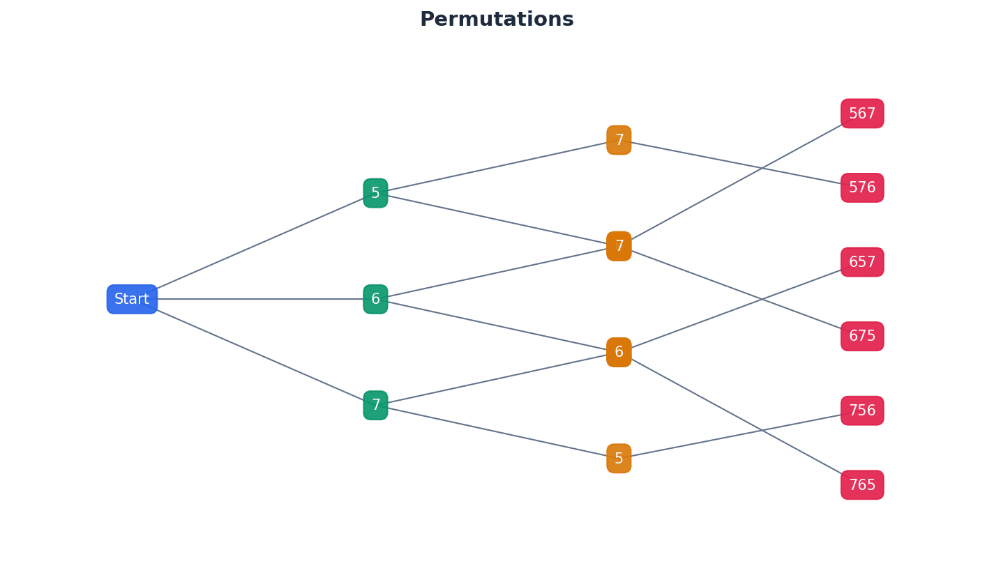
permutation — A selection of objects where the order of selection does matter.
Permutations consider both the selection of objects and their arrangement in a specific order. For example, AB is a different permutation from BA. This is like arranging books on a shelf: putting 'Book A' then 'Book B' is different from putting 'Book B' then 'Book A', as the order creates a distinct arrangement.
Students often confuse permutations and combinations. Remember that permutations involve order, while combinations do not. Look for keywords like 'arrange', 'order', or 'sequence' for permutations, and 'select', 'choose', or 'group' for combinations.
factorial function — A shorthand method of writing the product of an integer and all the integers below it down to 1, denoted by n!.
The factorial function, n!, represents the number of ways to arrange n distinct objects in a line. It is defined as n × (n-1) × (n-2) × ... × 1, with 0! defined as 1. For example, if you have 5 different books, 5! tells you how many different ways you can line them up on a shelf.
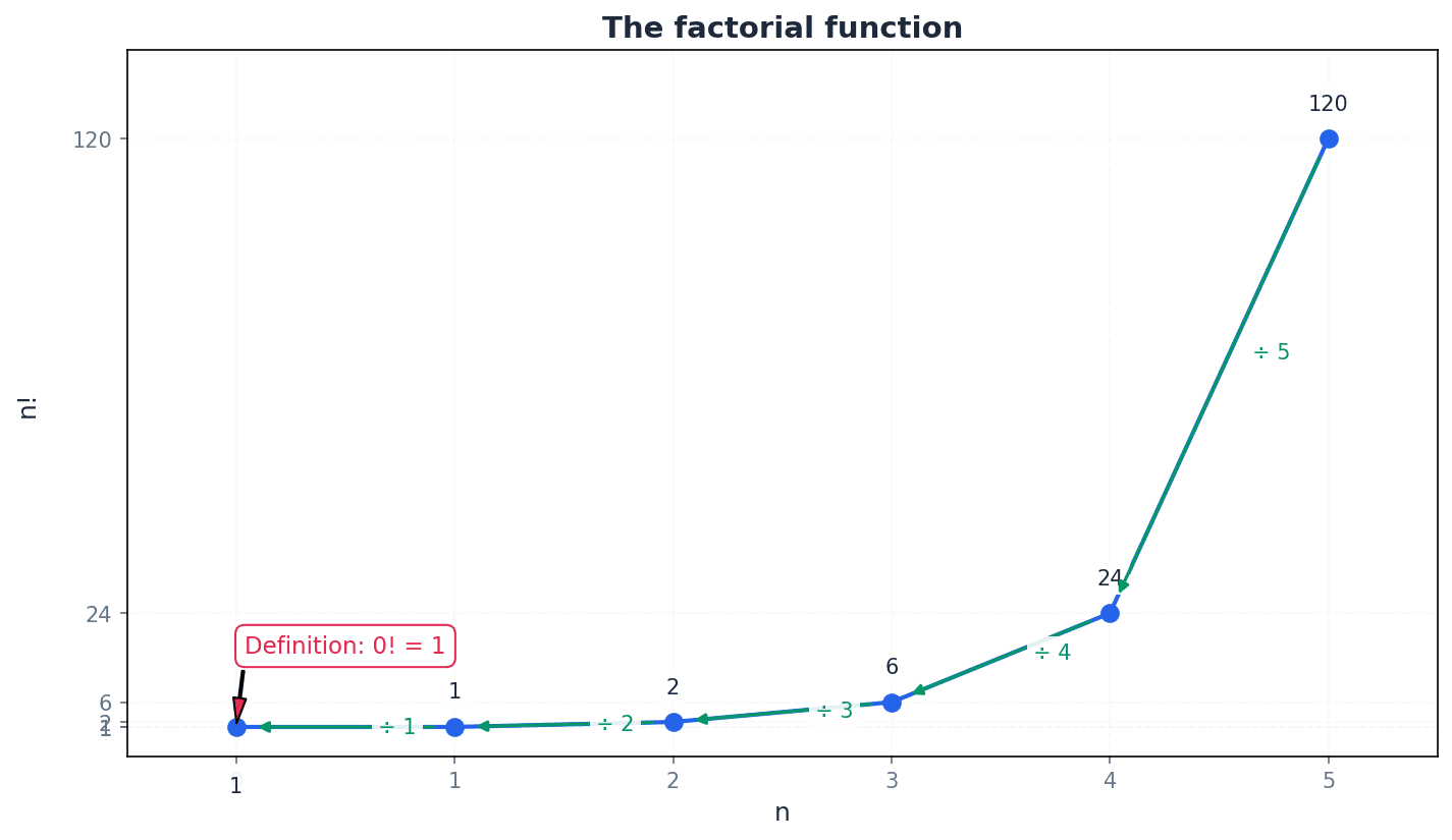
Students often think that 0! is 0, but actually 0! is defined as 1 to maintain mathematical consistency in formulas involving factorials.
Be careful with calculator usage for factorials; ensure you know where the n! or x! button is and how to use it for large numbers.
Permutations of n distinct objects
Used when all n distinct objects are selected and arranged.
When arranging a set of distinct objects, where each object is unique, the number of possible arrangements is given by the factorial of the total number of objects. For example, arranging five distinct boys in a row involves calculating 5!, as each position offers one fewer choice than the last.
Permutations of r objects from n distinct objects
Used when only r objects are selected and arranged from n distinct objects.
Sometimes, we need to arrange only a subset of objects from a larger distinct set. This is calculated using the permutation formula P(n,r), where 'n' is the total number of distinct objects and 'r' is the number of objects to be selected and arranged. This is useful for problems like arranging a specific number of cards from a deck.
Permutations of n objects with repetitions
Used when n objects include repetitions, where p+q+r+... = n.
When arranging objects where some are identical, the standard factorial formula overcounts arrangements. To correct this, we divide the total factorial by the factorial of the count of each type of repeated object. This ensures that arrangements of identical items are not counted as distinct.
Students often incorrectly apply the factorial function for repeated objects. Remember to divide by the factorial of the count of each repeated object to avoid overcounting.
Problems often include restrictions on arrangements, such as certain objects needing to be together, separated, or in specific positions. When solving these, it's crucial to address the restricted positions or groupings first. This might involve treating a group of objects as a single unit or considering mutually exclusive cases.
Always address restricted positions or groupings first when solving permutation problems. This simplifies the problem by fixing constraints early.
Combinations of r objects from n distinct objects
Used when r objects are selected from n distinct objects and the order of selection does not matter.
Combinations are used when the order of selection is irrelevant, focusing only on the chosen group. The formula C(n,r) calculates the number of ways to select 'r' objects from 'n' distinct objects without regard to their arrangement. This is distinct from permutations, where order is a key factor.
When a problem uses words like 'select', 'choose', or 'group', it usually indicates a combination problem where order is not important.
Probability of an event (permutations)
Used when an event consists of equiprobable favourable permutations.
Probability of an event (combinations)
Used when an event consists of equiprobable favourable combinations.
Permutations and combinations are fundamental for calculating probabilities in scenarios involving selections and arrangements. The probability of an event is found by dividing the number of favourable outcomes (either permutations or combinations) by the total number of possible outcomes (using the same method). It is crucial to consistently use either permutations for both numerator and denominator, or combinations for both.
Students often incorrectly calculate probabilities by mixing permutation and combination approaches in the same problem. Ensure both the numerator and denominator use the same method (either both permutations or both combinations).
When solving problems, clearly identify whether order matters to correctly choose between permutations and combinations. This is the first critical step in setting up your solution.
Break down complex problems into distinct, manageable scenarios before calculating, especially when dealing with 'at least' or 'at most' conditions. Sum the results from these mutually exclusive cases.
Exam Technique
Arranging n distinct objects in a line
Arranging n objects with repetitions
| Mistake | Fix |
|---|---|
| Confusing permutations and combinations. | Always ask: 'Does the order of selection/arrangement matter?' If yes, it's a permutation. If no, it's a combination. Look for keywords like 'arrange' vs. 'select'. |
| Incorrectly applying the factorial function for repeated objects. | When objects are identical, divide the total factorial by the factorial of the count of each repeated object (e.g., for 'AABB', it's 4!/(2!2!)). |
| Misinterpreting restrictions or failing to address them first. | For problems with restrictions (e.g., 'must be together', 'at the ends'), always deal with these constraints first. Treat grouped items as a single unit, or fix positions before arranging others. |
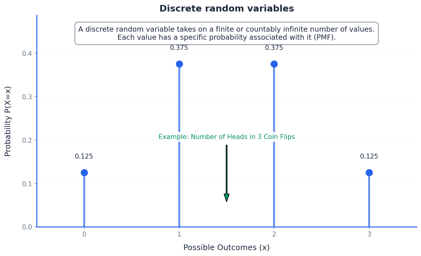
This chapter introduces discrete random variables, which are variables that can take only certain values by chance. It explains how to construct a probability distribution table, displaying all possible values and their probabilities, and details how to calculate the expectation (mean) and variance, providing measures of central tendency and spread.
Discrete random variable — A variable that can take only certain values that occur by chance.
These variables are typically counts or categories, such as the number of broken eggs in a carton or the number of 6s obtained when rolling dice. The possible values are distinct and separate, not continuous. Imagine counting the number of red cars you see on your commute; you can only see 0, 1, 2, etc., not 1.5 red cars.
Students often think 'random' means any value is possible for discrete random variables, but actually they can only take specific, countable values.
When asked to identify a discrete random variable, ensure the variable's possible values are clearly defined and countable, and state the set of these values.
Probability distribution — A display of all possible values of a discrete random variable and their corresponding probabilities.
This distribution can be shown as a table, a vertical line graph, or a bar chart, illustrating how the total probability of 1 is distributed among the possible outcomes. It provides a complete picture of the likelihood of each event. Think of a pie chart showing how a budget is allocated; each slice represents a possible value of the variable, and its size represents the probability of that value occurring.
Sum of probabilities
Used to verify a probability distribution or to find an unknown probability within a distribution.
Students often think a probability distribution only needs to list some probabilities, but actually it must include ALL possible values of the variable and their corresponding probabilities, summing to 1. Forgetting that the sum of all probabilities in a probability distribution must equal 1 is a common error.
When constructing a probability distribution table, always check that the sum of all probabilities is exactly 1. Failure to do so is a common error.
To construct a probability distribution table for a discrete random variable X, first identify all possible values X can take. Then, calculate the probability for each of these values, P(X=x). Finally, present these values and their corresponding probabilities in a table, ensuring the sum of all probabilities equals 1. This table provides a complete picture of the likelihood of each event.
Expectation — The mean of a discrete random variable X, written as E(X).
It represents the long-term average value of the random variable over a large number of trials. It is calculated by summing the product of each possible value and its probability. If you play a game many times, the expectation is the average score you would expect to get per game over the long run.
Expectation of a discrete random variable
Calculates the long-term average value of the random variable.
Students often think expectation is the most likely outcome, but actually it's the average outcome, which might not even be a possible value of the variable.
Ensure you multiply each value of X by its probability before summing them. A common mistake is to just sum the values or the probabilities.
Variance — A measure of the spread of values of a discrete random variable around its mean, E(X).
It quantifies how much the values typically deviate from the expectation. A higher variance indicates a wider spread of possible outcomes, while a lower variance indicates outcomes are clustered closer to the mean. If expectation is the target, variance is how scattered your shots are around that target.
Variance of a discrete random variable
Measures the spread of the values around the mean. An alternative formula is Var(X) = \sum(x - E(X))^2 P(X=x).
Students often think variance is the standard deviation, but actually variance is the square of the standard deviation, and it is in squared units. Incorrectly calculating variance by forgetting to subtract the square of the mean, i.e., using E(X^2) instead of E(X^2) - [E(X)]^2, is a frequent error.
Remember the formula for variance: E(X^2) - [E(X)]^2. A frequent error is forgetting to subtract the square of the mean, or incorrectly calculating E(X^2).
Standard deviation — The square root of the variance of a discrete random variable.
It provides a measure of spread in the same units as the random variable itself, making it more interpretable than variance. It indicates the typical distance of values from the mean. If variance is the area of a square representing spread, standard deviation is the side length of that square, giving a more direct measure of distance.
Always state the standard deviation to an appropriate number of significant figures, usually 3 s.f. unless otherwise specified in the question.
To find the expectation E(X), multiply each possible value of X by its probability and sum these products. For variance, first calculate E(X^2) by summing the product of each value squared and its probability. Then, use the formula Var(X) = E(X^2) - [E(X)]^2. The standard deviation is simply the square root of the calculated variance, providing a measure of spread in the original units of the variable.
Always start by drawing a clear probability distribution table if one isn't provided. This organizes your work and helps prevent errors in calculations.
For 'find the constant' problems, your first line of working should always be setting the sum of all probabilities equal to 1. When solving for an unknown probability, always check that your final answer is valid (i.e., between 0 and 1 inclusive).
Calculate variance in three clear steps to avoid errors: 1. Find E(X). 2. Find E(X²). 3. Substitute into Var(X) = E(X²) - [E(X)]².
Add columns for xP(X=x) and x²P(X=x) to your distribution table to keep calculations neat and easy to check. Read the question carefully to distinguish between being asked for 'Variance' and 'Standard Deviation'. Don't forget the final square root for the latter.
Exam Technique
Constructing a Probability Distribution Table
Finding an Unknown Constant in a Probability Distribution
| Mistake | Fix |
|---|---|
| Confusing 'random' with 'any value possible' for discrete random variables. | Remember that discrete random variables can only take specific, countable values, not continuous ones. |
| Forgetting that the sum of all probabilities in a probability distribution must equal 1. | Always verify \sum P(X=x) = 1, especially when solving for unknown constants or constructing a table. |
| Mistaking expectation (mean) for the most likely outcome. | Expectation is the long-term average, not necessarily the mode. It might not even be a possible value of the variable. |
This chapter introduces two fundamental discrete probability distributions: the binomial and geometric distributions. It covers how to identify situations where these models are appropriate, calculate probabilities using their respective formulae, and determine their expectation and variance.
discrete random variable — A variable whose value is obtained by counting.
Both binomial and geometric distributions model discrete random variables, meaning the variable can only take on specific, distinct, countable values (e.g., 0, 1, 2, 3 successes, or 1, 2, 3 trials). The number of cars passing a point in an hour is a discrete random variable because you can count them (0, 1, 2, ...), but you can't have 1.5 cars.
success — One of the two possible outcomes in a trial, typically the event of interest.
In the context of binomial and geometric distributions, each trial has two outcomes: 'success' or 'failure'. The probability of success, 'p', is constant across all trials. If you're looking for a 6 when rolling a die, getting a 6 is a 'success'.
failure — The other possible outcome in a trial, complementary to success.
If 'p' is the probability of success, then '1-p' (often denoted as 'q') is the probability of failure. These are the only two possible outcomes for each independent trial. If getting a 6 is a 'success' when rolling a die, then not getting a 6 (i.e., getting a 1, 2, 3, 4, or 5) is a 'failure'.
probability distribution — A table, graph, or formula that describes the probabilities of all possible outcomes of a random variable.
For discrete random variables like those in binomial and geometric distributions, it lists each possible value the variable can take and its corresponding probability. The sum of all probabilities in a distribution must equal 1. If you roll a fair die, the probability distribution would list P(1)=1/6, P(2)=1/6, ..., P(6)=1/6.
binomial distribution — A binomial distribution can be used to model the number of successes in a fixed number of independent trials.
It describes a discrete random variable where there are 'n' repeated independent trials, 'n' is finite, there are two outcomes (success/failure), and the probability of success 'p' is constant. The random variable is the number of trials that result in a success. Imagine flipping a coin 10 times and counting how many heads you get. The number of heads follows a binomial distribution because you have a fixed number of flips (10), each flip is independent, and there are only two outcomes (heads/tails) with a constant probability.
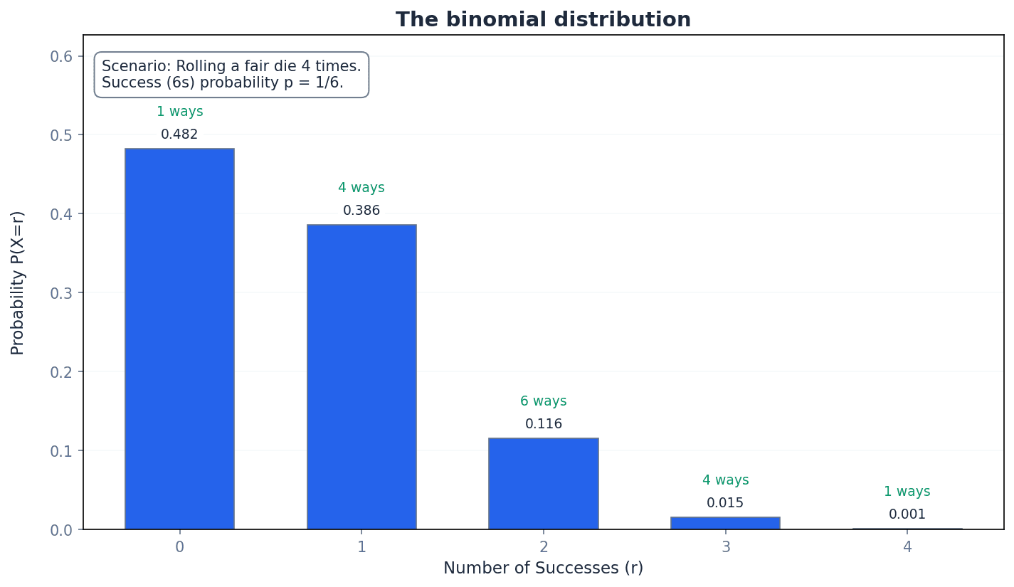
Binomial Probability Formula
Used for binomial distribution X ~ B(n, p). 'r' can take integer values from 0 to 'n'. Here, 'n' is the number of trials, 'p' is the probability of success, and 'r' is the number of successes.
coefficients — The numerical factors multiplying the terms in a binomial expansion.
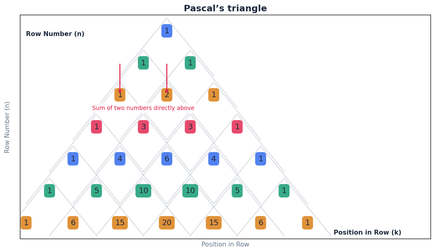
In the context of binomial distributions, these coefficients (represented by the 'nCr' notation or Pascal's triangle) indicate the number of different ways 'r' successes can occur in 'n' trials. In the expansion of (a+b)^2 = 1a^2 + 2ab + 1b^2, the numbers 1, 2, 1 are the coefficients.
When asked to identify a suitable model, ensure you explicitly state all four criteria for a binomial distribution (fixed n, independent trials, two outcomes, constant p) and relate them to the context of the problem.
Students often think that a binomial distribution applies to any experiment with two outcomes, but actually it specifically requires a fixed number of trials and a constant probability of success for each trial.
expectation — The long-term average value of a variable.
For a discrete random variable, expectation (or mean) is calculated as the sum of each possible value multiplied by its probability. For binomial distributions, a specific formula exists for expectation. If you play a game where you win 5 with 50% probability, your expectation is 2.50 per game over many plays.
Expectation of Binomial Distribution
Used for binomial distribution X ~ B(n, p). 'n' is the number of trials and 'p' is the probability of success.
variance — A measure of the spread or dispersion of a set of data points around their mean.
For a discrete random variable, variance is calculated as E(X^2) - [E(X)]^2. For a binomial distribution, a specific formula (npq) is used to calculate variance directly from its parameters. If two groups of students have the same average test score, the group with higher variance has scores that are more spread out.
Variance of Binomial Distribution
Used for binomial distribution X ~ B(n, p). Often written as npq, where q = 1-p. 'n' is the number of trials and 'p' is the probability of success.
standard deviation — The square root of the variance, providing a measure of spread in the same units as the random variable.
It quantifies the amount of variation or dispersion of a set of data values. A low standard deviation indicates that the data points tend to be close to the mean, while a high standard deviation indicates that the data points are spread out over a wider range of values. If the average height of students is 170 cm with a standard deviation of 5 cm, it means most students are between 165 cm and 175 cm.
Remember the specific formulae for expectation for binomial (np) and variance (npq) distributions. Do not try to calculate them from first principles unless explicitly asked.
Students often confuse variance with standard deviation, but actually standard deviation is the square root of variance, providing a measure of spread in the original units of the data.
geometric distribution — A geometric distribution can be used to model the number of trials up to and including the first success in an infinite number of independent trials.
It describes a discrete random variable where repeated trials are independent and can be infinite, there are two outcomes (success/failure), and the probability of success 'p' is constant. The random variable is the number of trials until the first success occurs. Think about rolling a die until you get a 6. The number of rolls it takes to get the first 6 follows a geometric distribution.
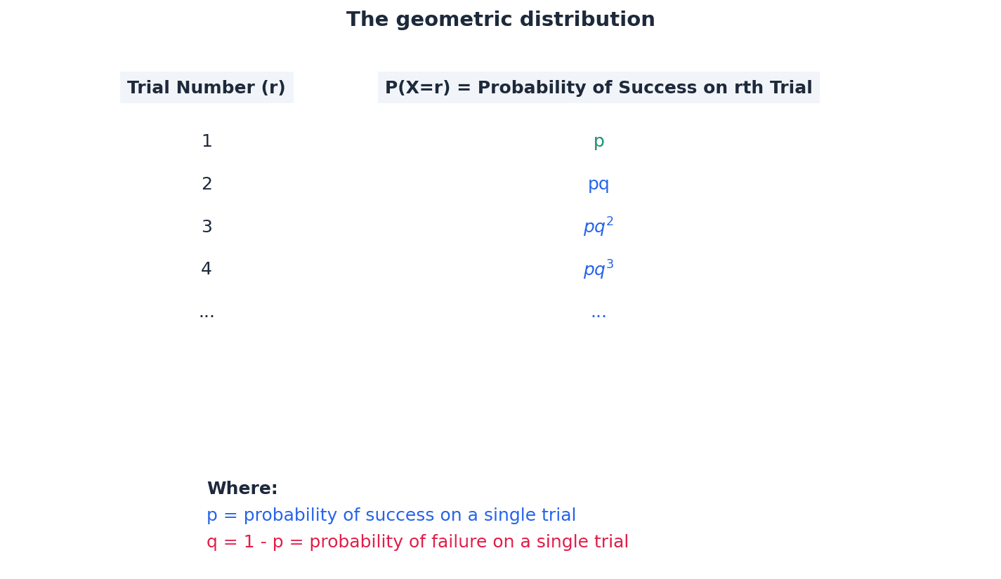
Geometric Probability Formula
Used for geometric distribution X ~ Geo(p). 'r' can take integer values 1, 2, 3, ... 'p' is the probability of success, and 'r' is the number of trials until the first success.
Probability of first success on one of the first r trials (Geometric)
Used for geometric distribution X ~ Geo(p). Also expressed as P(X ≤ r) = 1 - q^r. 'p' is the probability of success, and 'r' is the number of trials.
Probability of first success after the rth trial (Geometric)
Used for geometric distribution X ~ Geo(p). Also expressed as P(X > r) = q^r. 'p' is the probability of success, and 'r' is the number of trials.
Distinguish carefully between binomial and geometric distributions. If the question asks for the number of successes in a fixed number of trials, it's binomial. If it asks for the number of trials until the first success, it's geometric.
Students often think that a geometric distribution has a fixed number of trials like the binomial, but actually the number of trials is not fixed; it continues until the first success is achieved.
Expectation of Geometric Distribution
Used for geometric distribution X ~ Geo(p). 'p' is the probability of success.
mode — The value of the random variable that has the greatest probability.
For all geometric distributions, the mode is always 1, meaning the first success is most likely to occur on the first trial. For binomial distributions, the mode is the value of 'r' with the highest P(X=r). If a survey found that 50% of people prefer apples, then apples are the mode.
For geometric distributions, remember that the mode is always 1. For binomial distributions, you may need to calculate probabilities for adjacent values to find the highest one.
Always state which distribution you are using (e.g., X ~ B(n, p) or X ~ Geo(p)) before calculations and clearly define your random variable X in context, e.g., 'Let X be the number of successes'.
Exam Technique
Calculate binomial probability P(X=r)
Calculate binomial probability P(X < r), P(X > r), P(X <= r), P(X >= r)
| Mistake | Fix |
|---|---|
| Confusing binomial and geometric distributions. | Remember: Binomial is for a fixed number of trials and counting successes. Geometric is for trials until the *first* success, with an unfixed number of trials. |
| Incorrectly identifying 'n' or 'p' from the problem context. | Carefully read the question to determine the total number of trials (n for binomial) and the probability of the 'success' event (p) for a single trial. |
| Forgetting that the probability of failure is 1-p. | Always ensure p + q = 1. If p is given, q is simply 1-p. |
This chapter introduces the normal distribution as a model for continuous random variables, defined by its mean and variance. It covers calculating probabilities using standard normal tables and standardising variables. Crucially, it explains how to approximate the binomial distribution with the normal distribution, including the use of continuity corrections.
Continuous random variable — A quantity that is liable to change and whose infinite number of possible values are the numerical outcomes of a random phenomenon.
Unlike discrete variables, a continuous random variable can take any value within an interval, not just specific, countable values. For example, measuring a person's exact height could yield 170.12345... cm, not just 170 cm or 171 cm. The probability of it taking any single exact value is 0, but probabilities can be found for intervals.
Students often think that a continuous random variable can take specific values with non-zero probability, but actually the probability of a continuous random variable taking a particular value is necessarily equal to 0.
Probability density function — A curved graph that represents a function, y = f(x), for the probability distribution of a continuous random variable.
Abbreviated to PDF or pdf, the area under the graph of a PDF is always equal to 1, representing the total probability of all possible outcomes. It shows the relative likelihood of different values occurring, much like a landscape where the height of the land indicates how likely it is to find a value there.
Students often think the y-axis value of a PDF directly gives a probability, but actually the y-axis represents probability density, and only the area under the curve over an interval gives a probability.
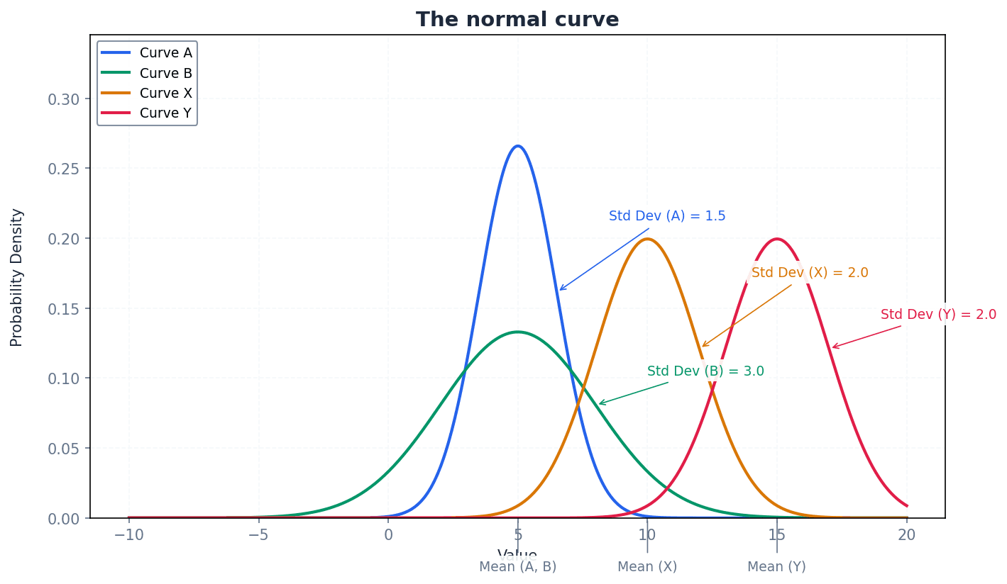
Normal curve — A symmetric, bell-shaped curve that represents a normal probability distribution.
This curve is characterised by its mean (µ) at the peak and line of symmetry, with probability density decreasing as values move further from the mean. Its width and height are determined by the standard deviation (σ), while the area under it remains 1. It's like a perfectly balanced bell, with the highest point being the average.
Students often think all bell-shaped curves are normal, but actually a normal curve has specific mathematical properties, including symmetry and fixed proportions of data within standard deviations of the mean.
When sketching a PDF, always ensure the curve is smooth, the total area under it is implicitly 1, and the shape reflects the distribution (e.g., symmetrical for normal, skewed for others).
Normal distribution — A mathematical function that represents the probability distribution of a continuous random variable as a symmetrical bell-shaped graph, defined by its mean (µ) and variance (σ²).
It is a theoretical model for many natural phenomena where values cluster around an average, with fewer values occurring further from the average, such as the heights of adult humans. Probabilities are found by calculating the area under its curve.
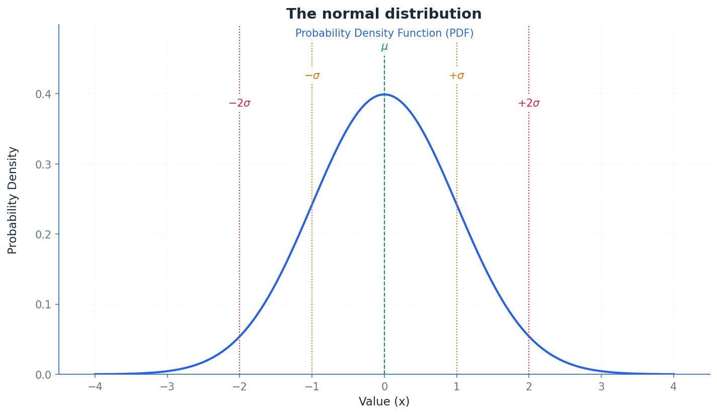
Normal Distribution Probability Density Function
Describes the shape of the normal curve for all real values of x. The area under this curve between two points gives the probability that X falls within that interval.
Students often think all continuous data follows a normal distribution, but actually many continuous variables are skewed or follow other distributions; the normal distribution is a specific model.
The normal distribution is a powerful model for continuous random variables, characterised by its mean (µ) and variance (σ²). To solve problems concerning a normally distributed variable, it is essential to state the distribution in the form X ~ N(µ, σ²) and sketch a diagram to visualise the required probability. Probabilities are found by calculating the area under its curve.
Standard normal variable — The normally distributed variable, denoted by Z, which has a mean of 0 and a variance of 1.
Any normal random variable X can be transformed into the standard normal variable Z through a process called standardising. This allows the use of a single set of tables (the standard normal distribution function table) to find probabilities for any normal distribution, acting like a universal ruler for normal distributions.
Standardising — The process of transforming a normal random variable X ~ N(µ, σ²) into the standard normal variable Z ~ N(0, 1) using the formula Z = (X - µ) / σ.
This transformation shifts the mean of the distribution to 0 and scales the standard deviation to 1. This is analogous to converting all currencies to a single reference currency to easily compare values, allowing probabilities for any normal distribution to be found using the standard normal distribution tables.
Standard Normal Variable (Z-score)
Used to transform any normal distribution X ~ N(µ, σ²) into the standard normal distribution Z ~ N(0, 1). This allows the use of standard normal tables to find probabilities.
Students often forget to divide by the standard deviation (σ) after subtracting the mean (µ), or they use the variance (σ²) instead of the standard deviation, leading to incorrect Z-scores.
Remember that Z ~ N(0, 1) is crucial. When standardising, ensure you correctly apply the formula z = (x - µ) / σ, and use the standard normal tables or calculator functions accurately.
Once a normal random variable X has been standardised to Z, probabilities can be found using standard normal distribution tables. These tables typically provide P(Z < z) for positive z-values. For probabilities involving negative z-values or intervals, properties of symmetry and the total area under the curve (which is 1) are used. For example, P(Z < -a) = 1 - P(Z < a).
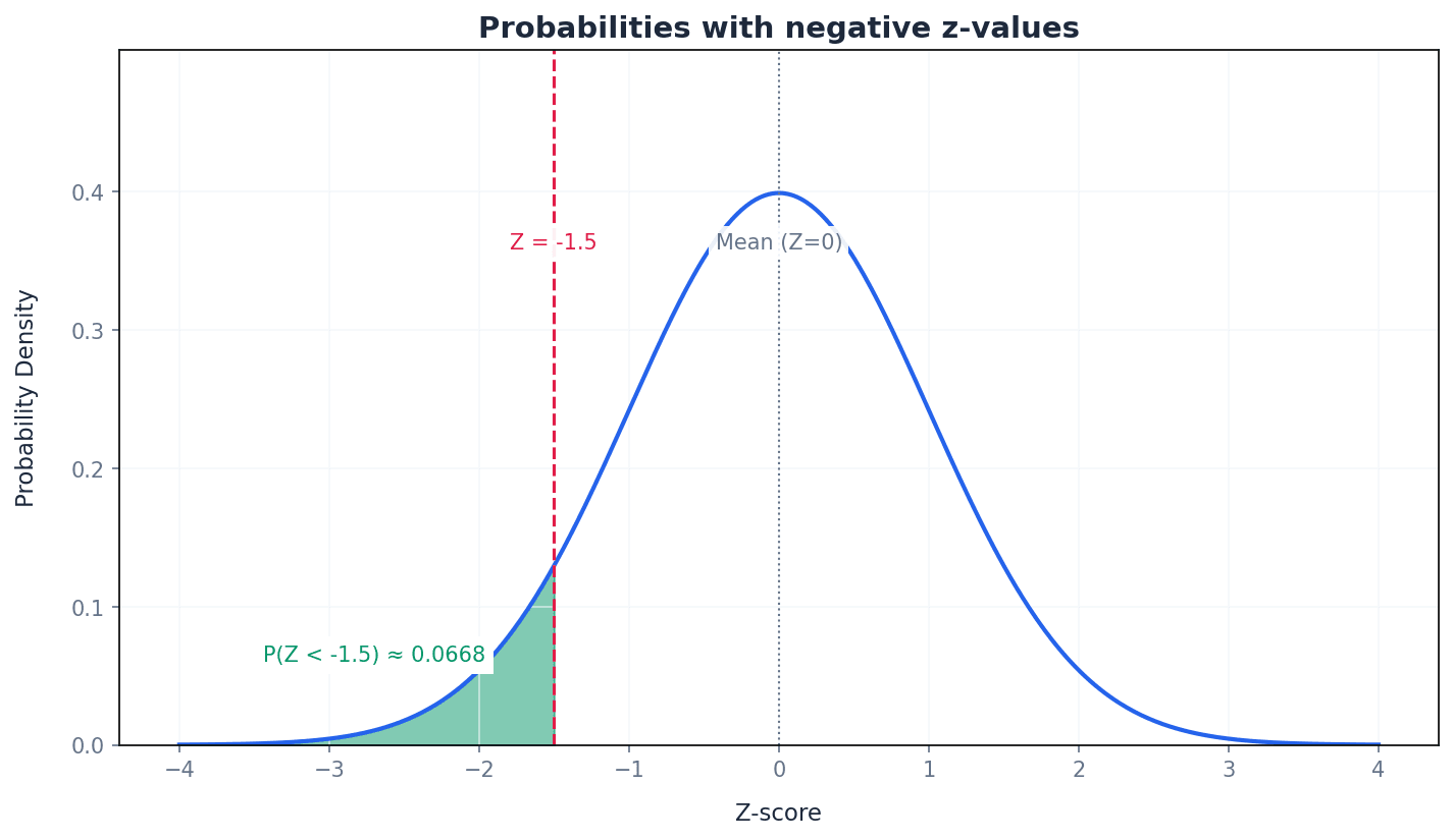
Students often make errors with negative Z-scores, particularly when using symmetry properties, forgetting that P(Z < -z) = 1 - P(Z < z).
The normal distribution can be used as an approximation to the binomial distribution B(n, p) under specific conditions: when the number of trials 'n' is large and the probability of success 'p' is close to 0.5. More formally, this approximation is valid if np > 5 and nq > 5 (where q = 1-p). This allows for easier calculation of probabilities for large binomial distributions.
Continuity correction — An adjustment made when a discrete distribution is approximated by a continuous distribution, where a discrete value x is represented by the continuous interval (x - 0.5, x + 0.5).
This correction is necessary because a discrete value (like 'exactly 13') has a non-zero probability in a discrete distribution but would have zero probability in a continuous distribution. By using an interval, the area under the continuous curve can accurately represent the discrete probability, much like measuring a range of weights for 'exactly 13 apples'.
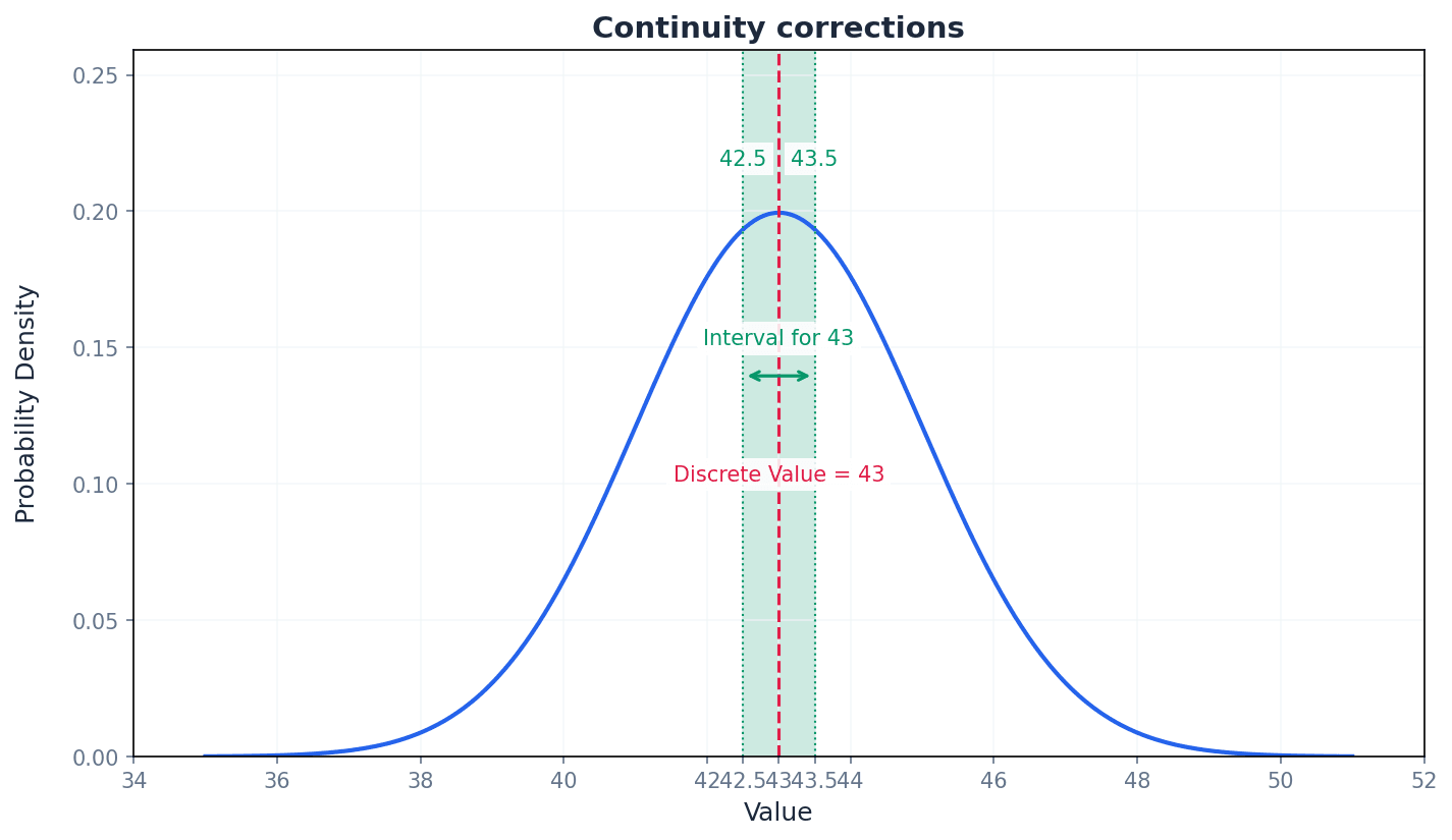
Students often forget to apply continuity corrections when approximating a binomial distribution with a normal distribution, or they apply the wrong boundary (e.g., using 13.5 for P(X < 13) instead of 12.5).
Always sketch a diagram to determine the correct continuity correction. For P(X = a), use P(a - 0.5 < X < a + 0.5). For P(X < a), use P(X < a - 0.5). For P(X ≤ a), use P(X < a + 0.5), and so on.
When solving problems involving a normally distributed variable, always state the distribution in the form X ~ N(µ, σ²) and sketch a diagram to visualise the required probability.
Always show your standardisation step clearly, including the formula and substitution of values, as this is often a mark-earning step in problem-solving.
When using normal approximation to binomial, explicitly state the conditions (np > 5, nq > 5) and the continuity correction applied.
Exam Technique
Finding P(Z < z) or P(Z > z) for Standard Normal Variable
Finding P(a < Z < b) for Standard Normal Variable
| Mistake | Fix |
|---|---|
| Confusing probability density with actual probability for continuous random variables. | Remember that the y-axis value of a PDF is density, not probability. Probability is always the area under the curve over an interval. |
| Incorrectly interpreting the effect of standard deviation on the shape of a normal curve. | A larger standard deviation (σ) means the data is more spread out, resulting in a wider and flatter normal curve. A smaller σ means a narrower, taller curve. |
| Forgetting to standardise X values to Z-scores when using standard normal tables. | Always convert your X values to Z-scores using Z = (X - µ) / σ before looking up probabilities in the standard normal tables. |
Generated by Nexelia Academy · nexeliaacademy.com