Probability & Statistics 1 · Representation of data
This chapter introduces methods for representing numerical data, distinguishing between qualitative, discrete, and continuous quantitative data. It details the construction and interpretation of stem-and-leaf diagrams for small discrete datasets, and histograms and cumulative frequency graphs for continuous data, emphasizing the importance of class boundaries and frequency density. The chapter concludes by guiding the selection of appropriate data representation methods based on data type, quantity, and purpose.
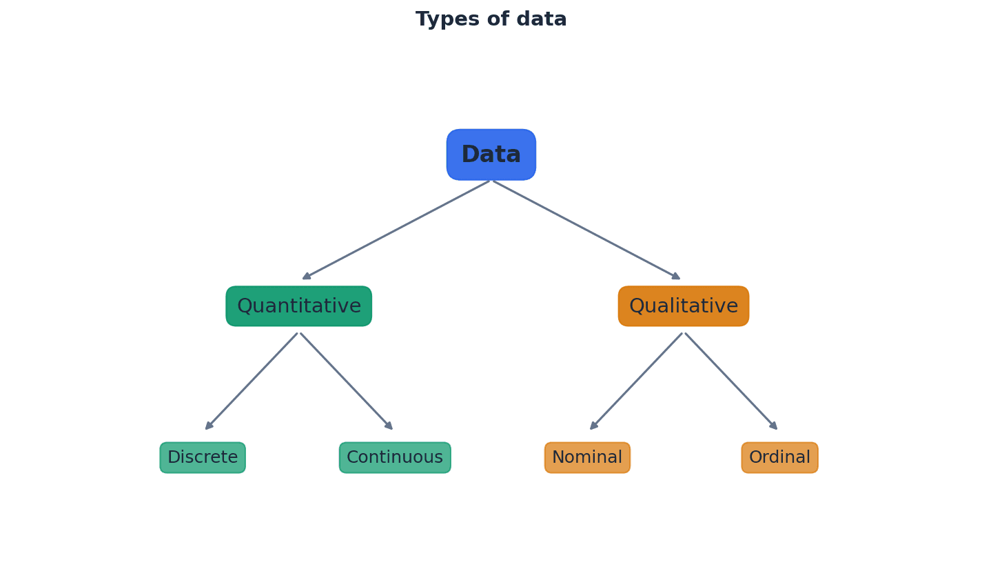
Qualitative data — Qualitative (or categorical) data are described by words and are non-numerical, such as blood types or colours.
This type of data categorizes observations into groups or types, rather than measuring them numerically. It helps in understanding characteristics or attributes that cannot be quantified. Imagine describing your favorite fruits: apple, banana, orange. These are categories, not numbers, just like qualitative data.
Categorical data — Qualitative (or categorical) data are described by words and are non-numerical, such as blood types or colours.
This is another term for qualitative data, emphasizing that the data falls into distinct categories. It is used when observations can be sorted into groups based on shared characteristics. Think of sorting clothes by color (red, blue, green); each color is a category, similar to categorical data.
Students often think qualitative data can sometimes be numerical, but actually it is strictly non-numerical and descriptive. Also, while some categorical data can be ordered (e.g., small, medium, large), not all of it can (e.g., blood types).
Quantitative data — Quantitative data take numerical values and are either discrete or continuous.
This type of data involves numerical measurements or counts, allowing for mathematical operations and statistical analysis. It provides information about quantities. Counting the number of students in a class or measuring their heights are examples of quantitative data, as they involve numbers.
Discrete data — Discrete data can take only certain values, as shown in the diagram.
This type of quantitative data results from counting and cannot be made more precise; there are distinct, separate values with no intermediate values possible. Examples include the number of items or shoe sizes. Counting the number of cars in a parking lot: you can have 1, 2, or 3 cars, but not 2.5 cars. This is like discrete data.
Continuous data — Continuous data can take any value (possibly within a limited range), as shown in the diagram.
This type of quantitative data results from measurement and can be made more precise, limited only by the accuracy of the measuring equipment. It can take any value within a given interval. Measuring a person's height: it could be 170 cm, 170.5 cm, 170.53 cm, and so on, limited only by the ruler's precision. This is like continuous data.
Students often think all numerical data is the same, but actually quantitative data is further divided into discrete (counted) and continuous (measured) types. Also, students often think discrete data must be integers, but it can take non-integer values like shoe sizes, as long as there are distinct, separate values. For continuous data, students often think it's always given with many decimal places, but it's the potential for infinite precision that defines it.
When describing quantitative data, always specify whether it is discrete or continuous, as this affects the appropriate representation and analysis methods. When identifying discrete data, look for situations where values are counted or have specific, fixed increments.
For small discrete datasets, a stem-and-leaf diagram is an effective way to display numerical data. This method separates each value into a 'stem' (the leading digit(s)) and a 'leaf' (the trailing digit), retaining the raw data while providing a visual representation of its distribution. It is particularly useful for comparing two related sets of data using a back-to-back stem-and-leaf diagram.
Stem-and-leaf diagram — A stem-and-leaf diagram is a type of table best suited to representing small amounts of discrete data.
It displays numerical data by separating each value into a 'stem' (the leading digit(s)) and a 'leaf' (the trailing digit). This method retains the raw data while providing a visual representation of its distribution, making it useful for comparisons. Imagine a tree branch (stem) with leaves (individual data points) growing off it. The leaves are ordered along the branch, and the branches are ordered vertically.
Key — A key with the appropriate unit must be included to explain what the values in the diagram represent.
In a stem-and-leaf diagram, the key clarifies how the stem and leaf digits combine to form the actual data values, including any decimal places or units. Without it, the diagram is ambiguous. Like a legend on a map, the key tells you what each symbol or number in the diagram actually means.
Students often omit the key in stem-and-leaf diagrams, making the diagram uninterpretable. Always include a clear and correct key, as it is a mandatory component for full marks.
Always include a key with appropriate units in a stem-and-leaf diagram to explain what the values represent, as this is crucial for interpretation and often a mark-earning point.
Back-to-back stem-and-leaf diagram — In a back-to-back stem-and-leaf diagram, the leaves to the right of the stem ascend left to right, and the leaves on the left of the stem ascend right to left.
This diagram is used to compare two related sets of data by sharing a common stem. It allows for easy visual comparison of the distributions of the two datasets. Think of two plants growing from the same central stalk, with leaves spreading out to either side, allowing you to compare their growth patterns.
Students often draw leaves in a back-to-back stem-and-leaf diagram incorrectly, failing to order them ascending outwards from the stem on both sides. The leaves on the left side of the stem must ascend right to left.
Ensure the leaves on both sides are correctly ordered (ascending outwards from the stem) and that a clear key is provided for both sets of data when constructing a back-to-back stem-and-leaf diagram.
When dealing with continuous data, especially when grouped into classes, it is crucial to define precise class boundaries rather than using the stated class limits. This eliminates gaps between classes and ensures continuity, which is essential for accurate representation in histograms and cumulative frequency graphs. These boundaries are calculated by finding the midpoint between the stated limits of adjacent classes.
Lower class boundary — Lower class boundaries are 145.5, 150.5 and 155.5cm.
For continuous data, the lower class boundary is the precise minimum value that can belong to a class, calculated by finding the midpoint between the stated lower limit of the class and the upper limit of the preceding class. It eliminates gaps between classes. If a road sign says 'Speed Limit 50-60 mph', the lower class boundary is not 50, but 49.5, meaning any speed from 49.5 up to 50.5 is rounded to 50.
Upper class boundary — Upper class boundaries are 150.5, 155.5 and 160.5cm.
For continuous data, the upper class boundary is the precise maximum value that can belong to a class, calculated by finding the midpoint between the stated upper limit of the class and the lower limit of the succeeding class. It ensures continuity between classes. Following the road sign example, the upper class boundary for 50-60 mph is 60.5, meaning any speed up to 60.5 is rounded to 60.
Class mid-values — Class mid-values are (145.5 + 150.5)/2 = 148, (150.5 + 155.5)/2 = 153 and (155.5 + 160.5)/2 = 158.
Also called midpoints, these are the average of the lower and upper class boundaries for a given class. They represent the central value of each class and are often used in calculations of measures of central tendency. If you have a group of friends whose ages range from 10 to 20, the midpoint age of that group would be 15, representing the average age within that range.
Students often use the given class limits (e.g., 146-150) directly for continuous data calculations, rather than correctly determining the class boundaries (e.g., 145.5-150.5). This leads to incorrect class widths and subsequent errors in histograms and cumulative frequency graphs.
Always calculate class boundaries for continuous data by considering the precision of the measurements (e.g., to the nearest cm means boundaries are .5 above/below the stated limits) to avoid errors in histogram construction.
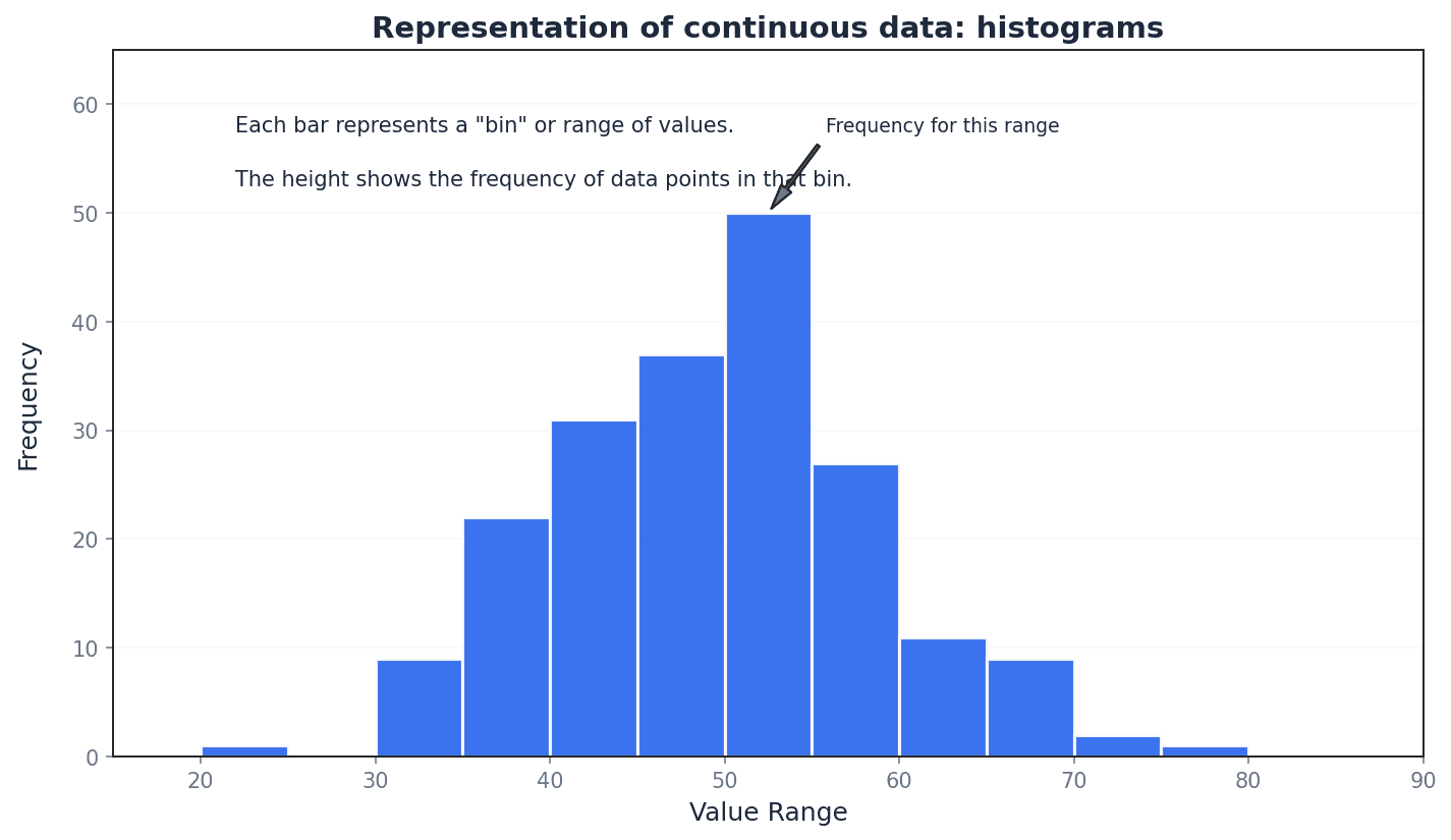
Histograms are graphical representations best suited for continuous data, though they can also illustrate discrete data. Unlike bar charts, the columns in a histogram have no gaps (unless a class has zero frequency), and the horizontal axis is a continuous number line. The key feature of a histogram is that the area of each column is proportional to the frequency of the corresponding class, which is particularly important when class widths are unequal.
Histograms — A histogram is best suited to illustrating continuous data but it can also be used to illustrate discrete data.
It is a graphical representation of the distribution of numerical data, where the area of each column is proportional to the frequency of the corresponding class. Unlike bar charts, there are no gaps between columns (unless a class has zero frequency) and the horizontal axis is a continuous number line. Imagine a city skyline where each building's width represents a range of values (class width) and its area represents how many data points fall into that range (frequency).
Students often confuse histograms with bar charts. In a histogram, the area of the bar represents frequency, and there are no gaps between bars for continuous data, unlike bar charts where bar height represents frequency and gaps exist.
Frequency density — The vertical axis of the histogram is labelled frequency density, which measures frequency per standard interval.
Frequency density is calculated by dividing the class frequency by the class width. It ensures that the area of each column in a histogram is proportional to the frequency, especially when class widths are unequal. If you have 10 people in a 5-meter wide room, the 'density' is 2 people per meter. Similarly, frequency density is 'frequency per unit of class width'.
Frequency density
Used for constructing histograms, especially with unequal class widths, to ensure column area is proportional to frequency.
Class frequency (from frequency density)
Used to calculate the frequency of a class when its frequency density and class width are known, often for estimating frequencies from a histogram.
Students often think frequency density is just frequency, but actually it's frequency divided by class width, which is crucial for correctly representing data in histograms with unequal class intervals. Also, students often assume that the class with the highest frequency in a histogram also has the highest frequency density, which is not necessarily true, especially with unequal class widths.
For histograms with unequal class widths, remember that the vertical axis must be labelled 'frequency density', not 'frequency', and the area of each column is proportional to its frequency. Always calculate frequency density correctly (frequency / class width) when constructing histograms, particularly when class intervals are not uniform.
Cumulative frequency graphs are another method for representing continuous data, allowing for the estimation of values such as medians, quartiles, and percentiles. These graphs plot the cumulative frequency against the upper class boundaries. They can be drawn as a polygon (straight lines connecting points) or a smooth curve, each offering a slightly different interpretation of the data distribution.
Cumulative frequency — Cumulative frequency is the total frequency of all values less than a given value.
It is a running total of frequencies, where each cumulative frequency value represents the sum of all frequencies up to the upper boundary of a particular class. It helps in determining the number of observations below a certain point. Imagine a running tally of scores in a game; each cumulative frequency is the total score up to that point, including all previous scores.
Cumulative frequency graph — A cumulative frequency graph can be used to represent continuous data.
This graph plots cumulative frequencies against upper class boundaries. It can be drawn as a polygon (straight lines) or a smooth curve and is used to estimate values like medians, quartiles, and percentiles, or the number of values above/below a certain point. Think of a staircase where each step represents a class interval, and the height of the step is the cumulative frequency up to that point, showing how the total count builds up.
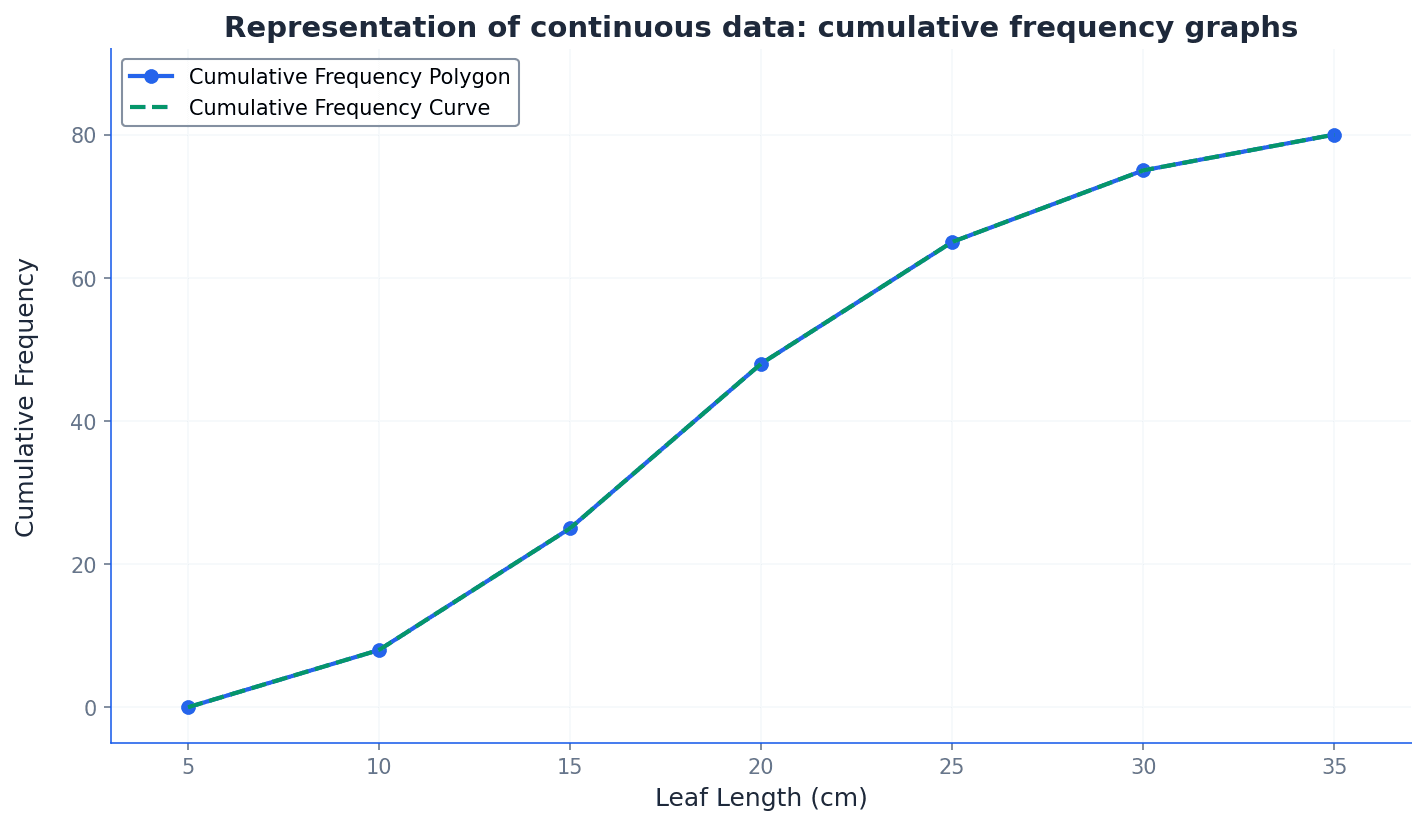
Cumulative frequency polygon — If we are given grouped data, we can construct the cumulative frequency diagram by plotting cumulative frequencies (abbreviated to cf) against upper class boundaries for all intervals. We can join the points consecutively with straight-line segments to give a cumulative frequency polygon.
This is a specific type of cumulative frequency graph where the plotted points are connected by straight lines. It provides a direct and unambiguous representation of the cumulative frequency distribution, and estimates from it should match those from a histogram. Imagine connecting the dots on a graph with a ruler; each line segment represents the assumption of an even spread of data within that class interval.
Cumulative frequency curve — If we are given grouped data, we can construct the cumulative frequency diagram by plotting cumulative frequencies (abbreviated to cf) against upper class boundaries for all intervals. We can join the points consecutively with straight-line segments to give a cumulative frequency polygon or with a smooth curve to give a cumulative frequency curve.
This is a type of cumulative frequency graph where the plotted points are joined by a smooth, freehand curve. It aims to represent the underlying continuous distribution more fluidly, though estimates from it may vary between individuals. Think of drawing a smooth, flowing line through a series of points, trying to capture the general trend rather than the exact straight-line connections.
Students often plot cumulative frequencies against class mid-values instead of upper class boundaries on cumulative frequency graphs. Remember that cumulative frequencies are plotted against the upper class boundaries. Also, students often think a cumulative frequency graph must always be a smooth curve, but a polygon (straight-line segments) is also valid and often more precise for estimates.
When constructing a cumulative frequency graph, ensure you plot cumulative frequencies against the upper class boundaries, and include a point at the lowest class boundary with a cumulative frequency of 0. When asked to draw a cumulative frequency graph, clearly label both axes, plot points accurately at upper class boundaries, and ensure the graph starts at (lowest class boundary, 0).
The choice of data representation method depends on the type of data, its quantity, and the purpose of the display. Stem-and-leaf diagrams are best for small discrete datasets, retaining raw data. Histograms are ideal for continuous data, showing distribution where the area of bars represents frequency. Cumulative frequency graphs are used for continuous data to estimate values like percentiles. Each method offers unique insights and is suited to different analytical needs.
Before drawing a histogram or cumulative frequency graph, create a new table with columns for class boundaries, class widths, and frequency densities or cumulative frequencies. This systematic approach helps prevent errors.
When asked to find a frequency from a histogram, use the formula: Frequency = Class Width × Frequency Density. Do not just read the height of the bar, especially with unequal class widths.
Method Frameworks
Common Errors
| Common mistake | How to fix it |
|---|---|
| Confusing histograms with bar charts. | Remember that in a histogram, the area of the bar represents frequency, and there are no gaps between bars for continuous data. The y-axis is frequency density, not frequency. |
| Using given class limits (e.g., 146-150) directly for continuous data calculations. | Always determine the correct class boundaries (e.g., 145.5-150.5) by finding the midpoint between adjacent class limits to ensure accurate class widths and eliminate gaps. |
| Plotting cumulative frequency against class mid-values or lower boundaries. | Cumulative frequencies must always be plotted against the upper class boundaries. Also, ensure the graph starts at the lowest class boundary with a cumulative frequency of 0. |
| Omitting the key in stem-and-leaf diagrams. | A clear key with appropriate units is mandatory for interpreting a stem-and-leaf diagram and for earning full marks. Always double-check its presence and accuracy. |
| Incorrectly ordering leaves in a back-to-back stem-and-leaf diagram. | Ensure the leaves on the right-hand side ascend left to right, and the leaves on the left-hand side ascend right to left (increasing outwards from the stem). |
| Assuming the class with the highest frequency in a histogram also has the highest frequency density. | This is not necessarily true, especially with unequal class widths. Always calculate frequency density (frequency / class width) to determine the 'density' of data within a class. |
Technique Selection
| When you see... | Use... |
|---|---|
| Small amounts of discrete data, retaining raw values, visualising distribution. | Stem-and-leaf diagram |
| Comparing two related small discrete datasets. | Back-to-back stem-and-leaf diagram |
| Continuous data, showing distribution, especially with unequal class widths. | Histogram (using frequency density) |
| Continuous data, estimating medians, quartiles, percentiles, or number of values above/below a point. | Cumulative frequency graph (polygon or curve) |
| Identifying characteristics or attributes that cannot be quantified. | Qualitative data analysis (not graphical representation in this chapter) |
| Numerical measurements or counts, allowing for mathematical operations. | Quantitative data analysis (further divided into discrete/continuous) |
Mark Scheme Notes